1681
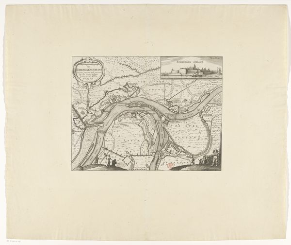
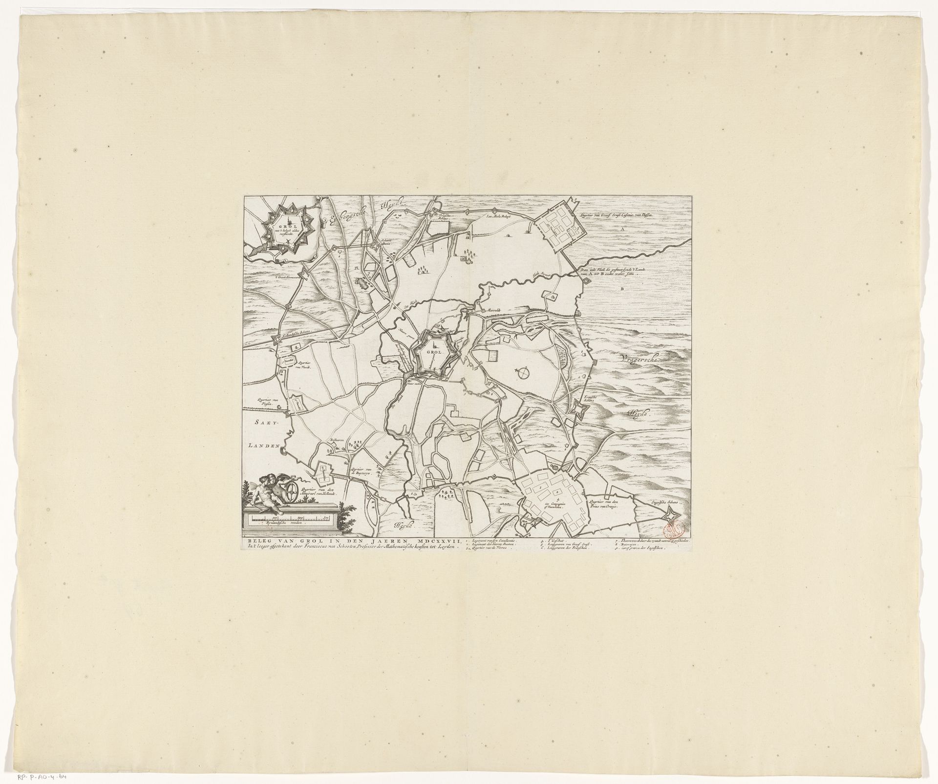
Kaart van het beleg van Groenlo, 1627
Listen to curator's interpretation
Curatorial notes
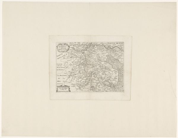
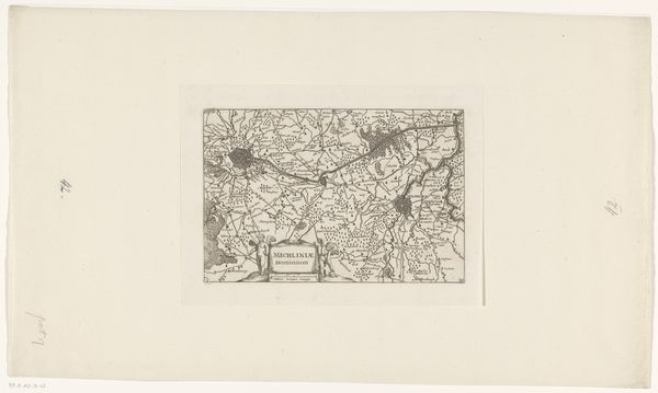
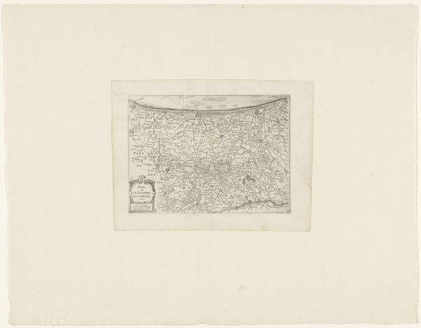
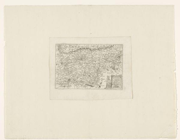
Editor: Here we have a print from 1681 titled "Kaart van het beleg van Groenlo, 1627", meaning "Map of the Siege of Groenlo". It's ink on paper. It gives me a sense of looking at a game board, with all those precise geometric shapes and lines. What do you see when you look at this work? Curator: Immediately, I'm drawn to the stark contrast achieved through the ink on paper. The engraver's skill is evident in the precision of each line, defining forms and spaces with clarity. Notice how the artist employs hatching and cross-hatching techniques to create tonal variations, suggesting depth and texture, and note the sharp delineations. Are you drawn to any specific visual aspect of the composition? Editor: The shapes themselves are interesting; I can make out some walled fortifications and what looks like open fields. But overall it still comes across as quite abstract. Is there a reason for that, considering that it’s supposed to be a historical map? Curator: Abstraction arises from a specific viewpoint. The artist prioritized capturing the geometric relationships between elements. Observe how the circular and rectangular shapes are positioned and interconnected by lines— the fortifications as opposed to roads or paths that cut across these planes and forms. Consider what kind of spatial logic is produced, rather than what is naturally rendered. Editor: So you're saying it’s less about faithfully recording reality and more about how the elements are arranged formally. It reminds me that cartography itself has a stylistic language, right? Curator: Precisely. Think of how the artist organizes these symbolic shapes, utilizing contrast, line work, and the balance of positive and negative space to present a visual argument about order and control. What impression do you have? Editor: Now I can see how focusing on line, shape and composition gives a different insight; the "map" reveals the strategy and imposition of order, a very powerful expression by using graphic, yet limited visual tools. Curator: A great observation about this kind of formal power – something I missed initially.
