print, textile, paper, typography
#
script typeface
#
script typography
#
baroque
# print
#
old engraving style
#
hand drawn type
#
textile
#
paper
#
typography
#
hand-drawn typeface
#
thick font
#
handwritten font
#
golden font
#
classical type
#
historical font
Dimensions: height 382 mm, width 241 mm
Copyright: Rijks Museum: Open Domain
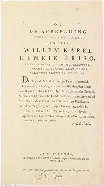
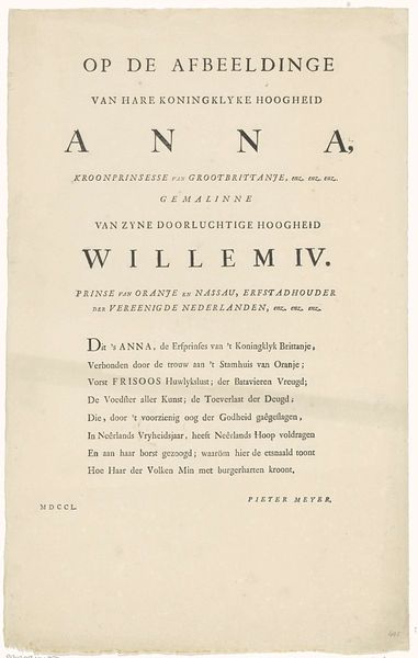
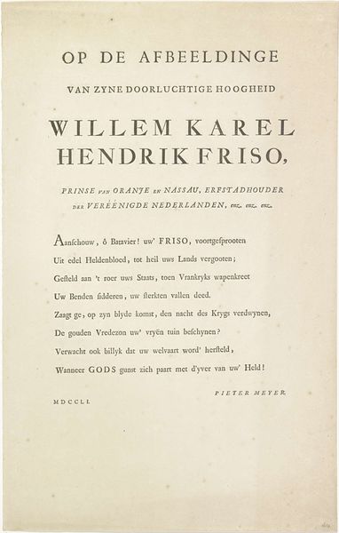
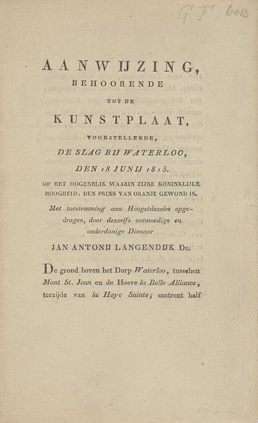
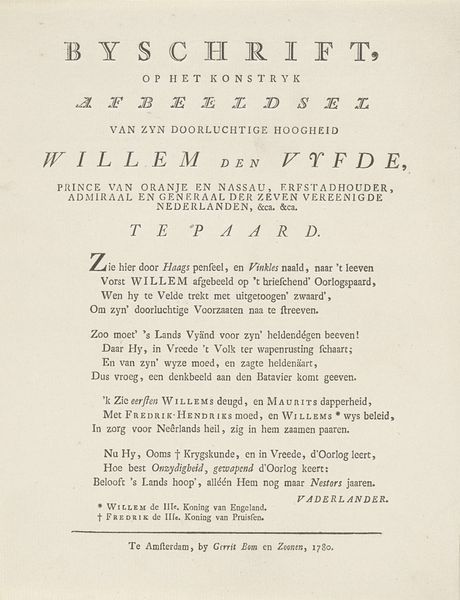
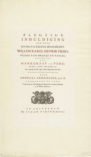
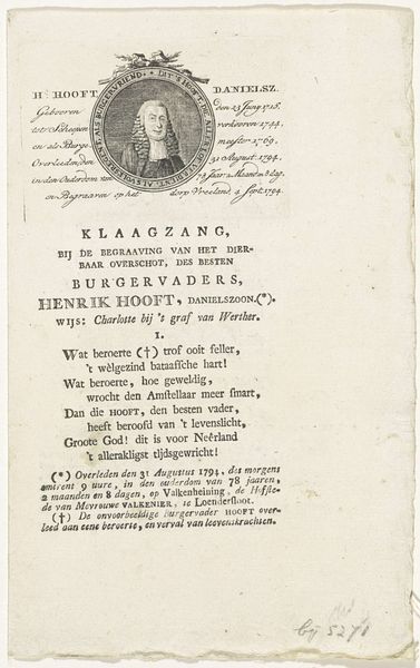
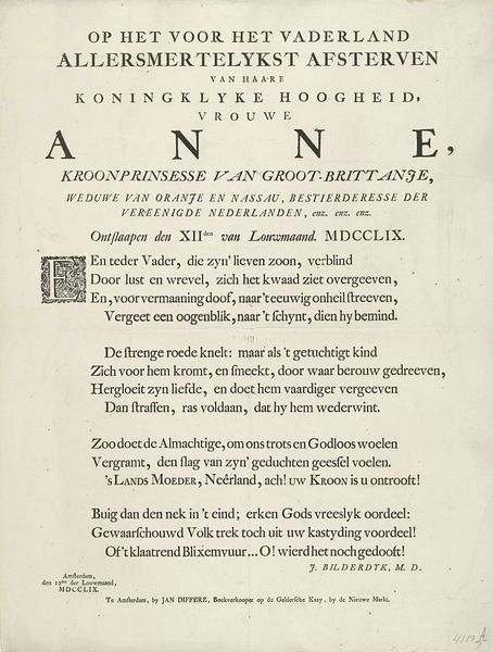
Curator: Let's consider this intriguing print from 1747 titled "Tekst bij het portret van Anna van Hannover," created by Frans de Haes. The print primarily consists of elaborate typography. Editor: It strikes me as quite formal, almost austere. The font, although intricate, lends an air of restraint. It speaks of official pronouncements, wouldn’t you say? What was this used for? Curator: Indeed. This piece likely functioned as a commemorative text intended for display alongside a portrait of Anna van Hannover. Considering her position as Princess Royal and Princess of Orange through her marriage to William IV, the text honors her lineage and virtue. The medium is fascinating here, as typography, especially of this calligraphic hand-drawn quality, blends textual meaning with material presence. It invites questions about printmaking’s place between art and utility in the Baroque period. Editor: It's compelling how the paper and the ink combine, they communicate the value of the printed word, right? Someone crafted these individual letterforms, each with meticulous strokes and weighted lines. Look at the inscription towards the bottom; it mentions the bookseller Nikolaes Smithof and his claim of copyright over only his own signed printing. Curator: The handwritten font and classical type further reflect the era's sensibility. This period was very much engaged with antiquity and, through their printing practices, hoped to transmit those virtues and lessons to their audience. We see an embrace of established societal structure through the piece. Editor: Agreed. And look how textile design enters into it. We see not only patterns in the letter forms, but in their arrangement to draw our eye. One recognizes immediately how social norms and conventions impacted the labor involved in print production and consumption. Curator: Absolutely, viewing it from that lens really drives home the point about accessibility to information, dissemination of political image, and the overall value assigned to the printed word during that time. This intersection of print, text, and power offers insight into both historical practices and prevailing attitudes. Editor: A very fruitful examination. It's the combination of hand-craft, medium, and declaration that fascinates me most, offering layers of understanding concerning this print and Anna of Hannover. Curator: I find that focusing on how a piece reflects and affects prevailing power structures always unveils nuances missed if one only looks at aesthetics or symbolic readings in a vacuum. This piece helps us trace those socio-political roots.
Comments
No comments
Be the first to comment and join the conversation on the ultimate creative platform.
