graphic-art, print, typography, engraving
#
script typeface
#
graphic-art
#
baroque
# print
#
old engraving style
#
hand drawn type
#
typography
#
hand-drawn typeface
#
stylized text
#
thick font
#
handwritten font
#
golden font
#
classical type
#
engraving
#
historical font
Dimensions: height 487 mm, width 306 mm
Copyright: Rijks Museum: Open Domain
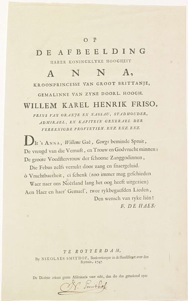
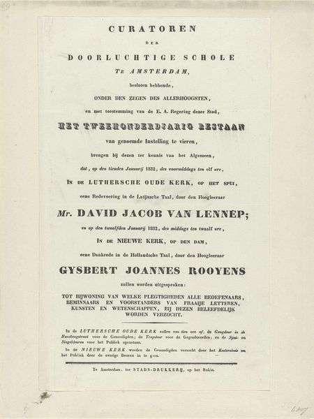
Curator: Right now we're standing in front of "Tekst bij het portret van Anna van Hannover," a piece created in 1750 by Pieter Meyer. It's an engraving, which gives it this beautifully precise, almost austere feel. What's your initial impression? Editor: Austere, yes, but also… celebratory. It feels like a royal announcement, but also deeply personal. The stylized text almost looks like a crown, a tangible weight given to her name and title. It's quite the blend of public declaration and intimate portrait, even without an actual portrait visible. Curator: Precisely! It serves as a textual portrait. Notice the Baroque style, that ornate sensibility expressed solely through typography. The engraving is not just about conveying information; it's about presenting that information in a way that reflects Anna's status and the spirit of the time. The hand-drawn type, so lovingly rendered, suggests something crafted and carefully considered, instead of cold, printed text. Editor: Absolutely. Each letter feels deliberately chosen, pregnant with significance. Even the flourishing script evokes that era's penchant for the symbolic, a very different cultural lens than the simplified forms we favor now. The absence of her image almost enhances the iconic quality. Curator: The language itself plays a crucial role. Consider the phrases – "Princess of Great Britain," "Gemalinne." These are not mere descriptions; they are carefully chosen words, each carrying centuries of social and political weight, all culminating in a single artistic expression. Editor: That’s right, it really is. It is more than just text; the lettering and layout reflect aspirations and cultural values surrounding monarchy, legacy and connection. Curator: Absolutely, that visual declaration is the thing here. A reminder of how even something as seemingly simple as typography can become a powerful carrier of meaning, a true artwork. Editor: Agreed. Makes you consider how we construct identity today, not through ornate pronouncements, but through… less durable, but no less fascinating means.
Comments
No comments
Be the first to comment and join the conversation on the ultimate creative platform.
More like this