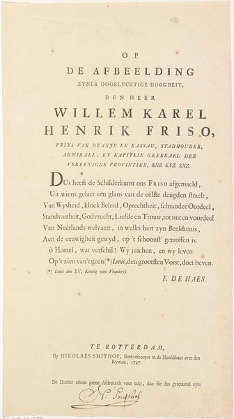
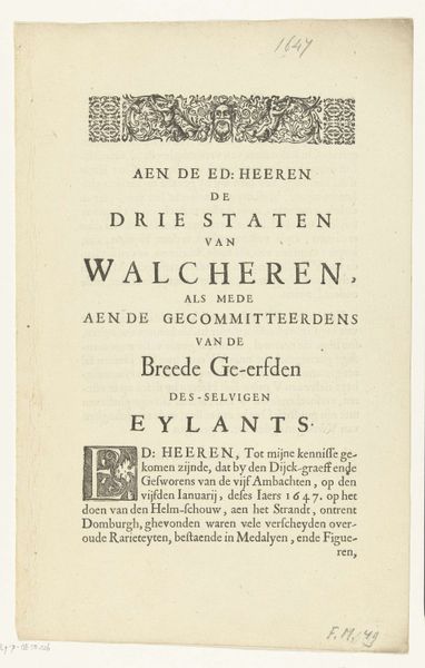
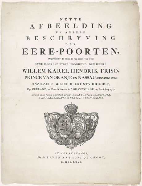
Titelpagina uit: D.T, Huët, Inhuldiging van zijne doorluchtige hoogheid Willem Karel Hendrik Friso (...) als erf-heer van Vlissingen, op den Vden junij MDCCLI 1753
0:00
0:00
isaaktirion
Rijksmuseum
print, typography, engraving
#
script typography
#
baroque
# print
#
old engraving style
#
hand drawn type
#
hand lettering
#
typography
#
hand-drawn typeface
#
fading type
#
thick font
#
handwritten font
#
golden font
#
engraving
#
historical font
Dimensions: height 415 mm, width 255 mm
Copyright: Rijks Museum: Open Domain
Curator: Before us, we have a title page, “Inhuldiging van zijne doorluchtige hoogheid Willem Karel Hendrik Friso…als erf-heer van Vlissingen," which translates to "The Inauguration of his Most Serene Highness Willem Karel Hendrik Friso...as hereditary Lord of Vlissingen." Created in 1753 by Isaak Tirion, it marks a historical event with considerable flourish. Editor: What strikes me immediately is the sheer declaration of it all! It’s like a carefully choreographed pronouncement etched in ink. Did they have font wars back then too? Because that feels very much on purpose. Curator: The typography definitely sets the tone. Look at how the text size and font vary to emphasize different aspects of William's titles. It reflects the social hierarchy of the time and emphasizes his elevated status. Remember, this was an age where every visual detail reinforced social order. Editor: Totally, it’s a power move communicated through kerning! But it's not just formal; there’s a delightful almost sea-monster emblem at the bottom. It almost makes me feel like flipping through the book as if this invitation was left for me to witness Curator: The emblem, probably incorporating the coat of arms for Vlissingen, serves as a symbolic marker of civic pride. This print would have circulated among the elite, reinforcing William's legitimacy and strengthening ties between the House of Orange and the city. These public records and commemorations solidify this sense of a lineage. Editor: I wonder how common it was to have graphic design that's quite this maximalist? Between the ornate lettering and heraldry, it's almost overwhelming! It really grabs your attention, and sort of begs that whoever the new Lord to step up to his responsibilities and uphold those grand standards of aesthetic authority, if you will. Curator: Precisely. These kind of publications visually linked rulers and city power to ideas of historical glory. It reinforced power through cultural output but moreover served to signal new ways of accessing tradition by modernizing typographic forms. It's about legacy and about claiming relevance in the present moment. Editor: Thinking about it now, that kind of showmanship probably works, but imagine being Prince William dealing with those big expectations every day. Today, this piece invites us to understand how image, power, and persona are constructed for us to understand leadership from afar. What do you think? Curator: I couldn't agree more. A great reflection on how these past practices of documentation and historical presentation shape the power of how imagery operates. It still asks those core questions today!
Comments
No comments
Be the first to comment and join the conversation on the ultimate creative platform.
More like this