print, paper, typography
#
portrait
#
script typeface
#
script typography
#
hand-lettering
#
dutch-golden-age
# print
#
hand drawn type
#
hand lettering
#
paper
#
typography
#
hand-drawn typeface
#
fading type
#
thick font
#
handwritten font
#
historical font
Dimensions: height 384 mm, width 231 mm
Copyright: Rijks Museum: Open Domain
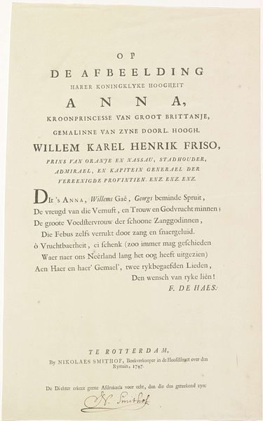
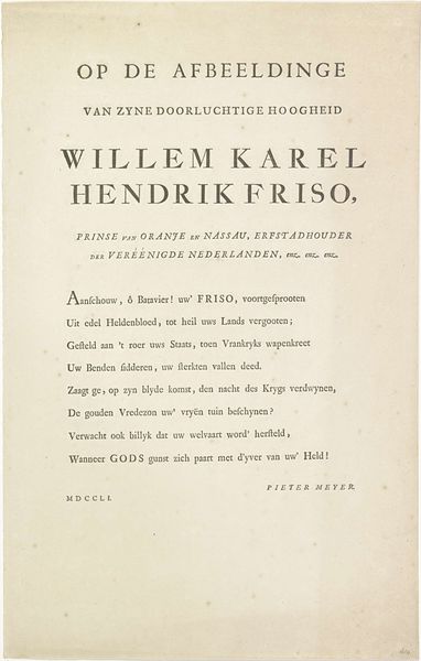
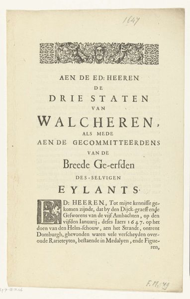
Editor: We're looking at "Tekst bij het portret van Willem IV, prins van Oranje-Nassau," a print from 1747 by Frans de Haes. It’s mostly typography, and at first glance, I'm struck by how declarative it feels. What stands out to you in terms of composition or structure? Curator: Immediately, the interplay of various typefaces arrests my attention. Consider the stark contrast between the block-like capitals of Willem Karel Hendrik Friso’s name, versus the more delicate, cursive script of the poem beneath. How do these deliberate choices in lettering impact our perception of the subject? Does it perhaps denote the bifurcation between authority and artistic interpretation? Editor: That's a fascinating point. It seems the rigid font reinforces his position, while the flowing script allows for a more expressive, almost emotional, commentary. So, are you saying that these typographic contrasts are the main components that bring this artwork into being? Curator: Indeed, and it’s imperative we consider the spatial relationships. Observe how the heavier typeface visually anchors the upper portion, bestowing a sense of prominence. Then consider the descending lines of script; how do they function to guide the eye? Editor: They definitely draw you down the page. Almost like reading a proclamation followed by an explanation or ode. It creates a structured hierarchy, visually and informationally. Curator: Precisely. De Haes manipulates the visual language of typography to establish a clear power dynamic, doesn’t he? The use of different font weights and styles underlines key phrases and reinforces the poem's message. Editor: I never would have noticed those power dynamics! Thanks to your explanations about typefaces, it gives the artwork new layers of complexity for me to now explore. Curator: Indeed, the semiotics of typography unlocks considerable meaning!
Comments
No comments
Be the first to comment and join the conversation on the ultimate creative platform.
More like this