graphic-art, print, typography, engraving
#
script typeface
#
graphic-art
#
medieval
#
script typography
#
hand-lettering
# print
#
old engraving style
#
hand drawn type
#
hand lettering
#
typography
#
hand-drawn typeface
#
pen work
#
handwritten font
#
golden font
#
engraving
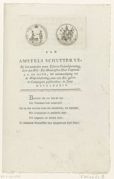
Dimensions: height 385 mm, width 230 mm
Copyright: Rijks Museum: Open Domain
Curator: Welcome. Here we have the “Oorkonde van het Atheneum Illustre in Amsterdam,” a fascinating engraving dating from between 1693 and 1812. Look at how the light plays across the scripted letters and heraldic details. Editor: It feels...stiff. So formal and austere, like an announcement etched in stone, yet also surprisingly delicate. All that scripted typeface gives it a certain elegant rigidity. Curator: Indeed. The composition is meticulously balanced, isn’t it? Observe the careful arrangement of the text, its placement in relation to the Amsterdam coat of arms with those lions. Editor: Precisely, and that's exactly what makes me want to dig deeper. The formality broadcasts authority and power. What power structures are at play? Who gets commemorated in such an elaborate manner, and who is excluded? Curator: The inscription seems to celebrate a young scholar. Perhaps someone attached to the Atheneum. Note the classical allusions: “Ingenuum magnaeque spei juvenem” evokes a tradition of humanistic learning. The choice of Latin and the careful calligraphy all speak to the importance of classical education in that era. Editor: Agreed. But even the use of Latin here becomes a social marker, right? Reinforcing a divide between the educated elite and the general populace. Access to this type of knowledge would have been incredibly exclusive. And let's consider the role of institutions like the Atheneum in solidifying these social hierarchies. Curator: A compelling point. We should note the skill involved in crafting such lettering. Each stroke carries weight. Also consider the overall design - its linear clarity and proportion creates a striking visual order that emphasizes stability and tradition. Editor: While I appreciate the artistry, I’m always driven to unpack the assumptions behind "stability" and "tradition", especially in art connected to institutions. Stability for whom? Whose traditions are we preserving, and at what cost? This "Oorkonde" becomes much more interesting when viewed as a statement about Amsterdam's power, its scholarship, and, unavoidably, its societal divisions. Curator: It is remarkable how much historical weight rests upon these elegantly rendered lines. Thank you for pointing that out. Editor: My pleasure. It's always enlightening to look beyond surface aesthetics and consider the layers of meaning embedded in every artwork.
Comments
No comments
Be the first to comment and join the conversation on the ultimate creative platform.
More like this