graphic-art, print, typography
#
script typeface
#
graphic-art
#
dutch-golden-age
# print
#
old engraving style
#
hand drawn type
#
typography
#
stylized text
#
thick font
#
handwritten font
#
golden font
#
classical type
#
historical font
#
columned text
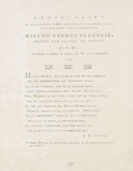
Dimensions: height 256 mm, width 197 mm
Copyright: Rijks Museum: Open Domain
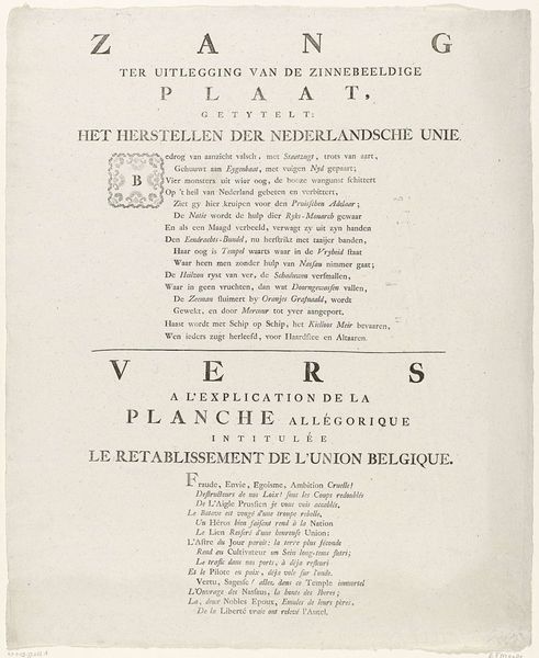
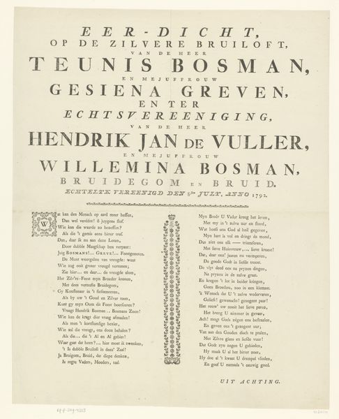
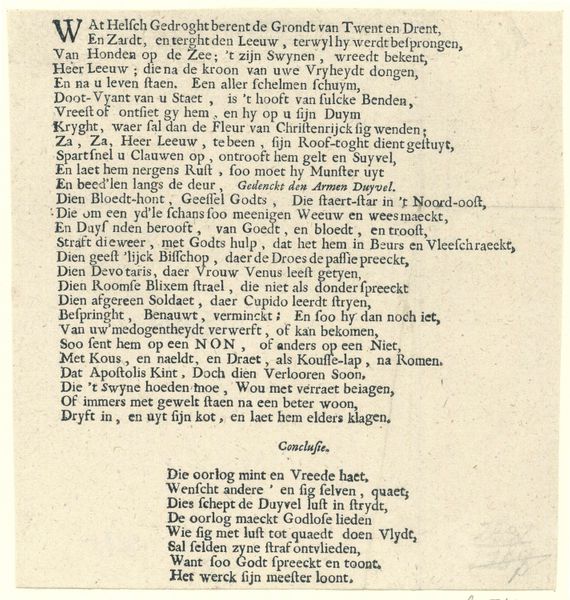
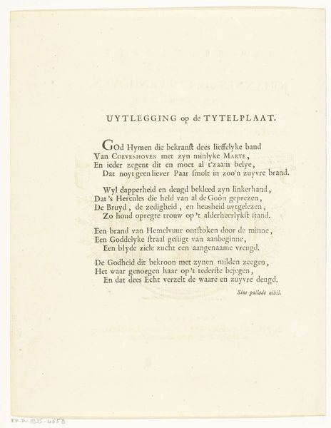
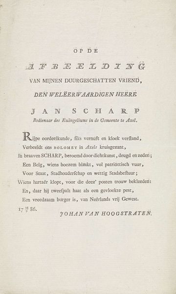
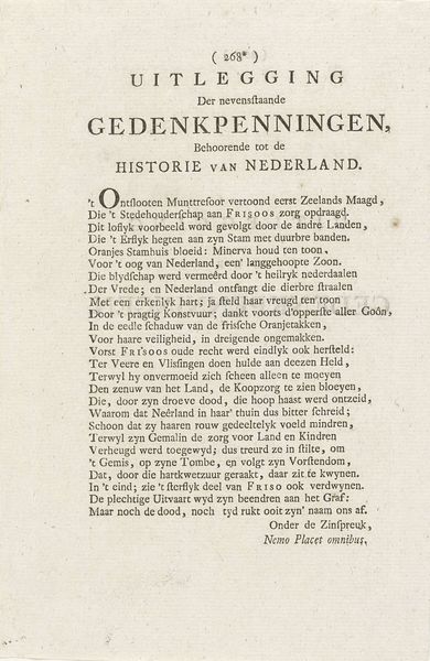
Curator: This print, created around 1780 by G. Bom, bears the title "Tekst bij het ruiterportret van Willem V, prins van Oranje-Nassau." Editor: My first impression is that the print is striking in its design, despite its age. The letterforms create texture, almost like fabric. There is something both classic and dynamic about it. Curator: Absolutely. The text isn't just informational. This piece embodies the late 18th-century Dutch cultural landscape, saturated with notions of national identity and princely leadership. We see the stylized text and heroic language. Consider the context of its creation, with Willem V struggling to maintain power amidst growing political instability. This work clearly aims to reinforce his image. Editor: I am interested in how the print employs symmetry to underscore these very themes of stability and authority you address. The deliberate arrangement of the lines, the balanced weight of the typeface; everything serves to visually represent an order that the text describes. Even with all the S-curves that add ornamentation, there's a structural rigor to the lettering itself. Curator: Yes, and this is meant for public consumption. The print operates as a piece of propaganda designed to associate Willem V with military might and historic legacy. It also suggests an implied continuity of leadership through the allusions to earlier prominent leaders. How effective this messaging actually was at that particular point in history is highly debatable given the rise in Patriot sentiment against the Stadtholder. Editor: I agree. You are directing me towards something interesting there, the potential friction between this work as a celebration of form and its aim as effective social commentary. To what degree did the rigid and perhaps slightly old-fashioned presentation resonate versus becoming another symbol of establishment power? Curator: I’d argue the deliberate embrace of established, even nostalgic, typefaces and textual structure plays a significant role. It is less about genuine dialogue or persuasion and more about reinforcing the status quo through recognizable symbols and language. This kind of art piece should prompt critical discussion about its socio-political effect then and now. Editor: These closing comments remind me that even an exploration of such fine-grained material properties can bring out salient points about broader cultural factors and motivations. Curator: Precisely; seeing beyond the artistry uncovers layers of historical dialogue that both reflect and actively construct social reality.
Comments
No comments
Be the first to comment and join the conversation on the ultimate creative platform.
More like this