Dimensions: image: 18.8 x 21.3 cm (7 3/8 x 8 3/8 in.)
Copyright: CC0 1.0
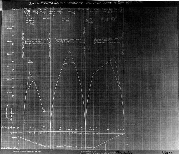
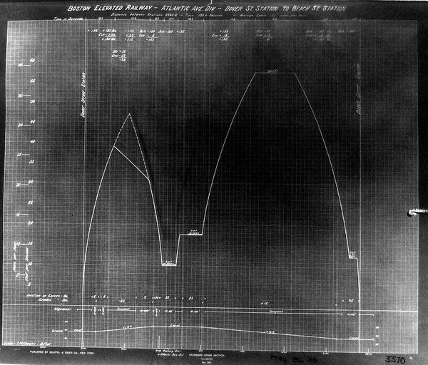
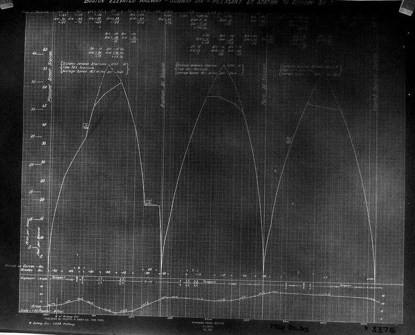
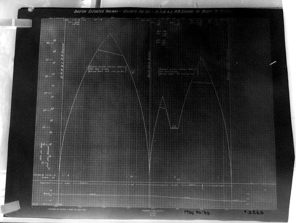
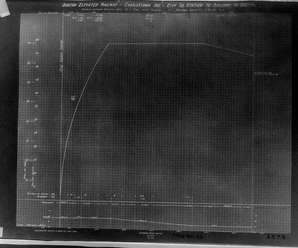
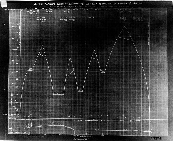
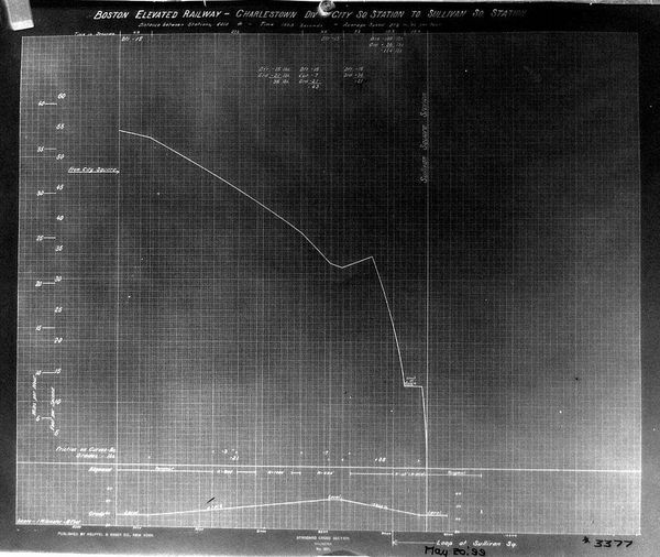
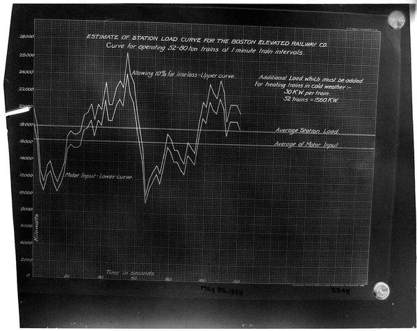
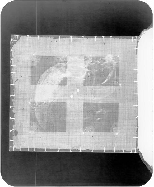
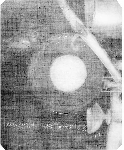
Curator: This is Paul Rowell's "Chart BERy, Atlantic Ave. Div." from the Harvard Art Museums. Editor: It looks like a blueprint. Industrial, functional, almost stark. Curator: Indeed. The composition is dominated by these stark white lines against a gridded background. The lines, charting speed and distance of the Boston Elevated Railway, are a study in efficiency. Editor: This chart speaks to the rapid urban expansion of the early 20th century. It's a visual representation of progress, but also of the displacement and disruption that often accompanied it. Who benefited from this efficiency? Who was left behind? Curator: The beauty, perhaps, lies in its utility—in its pure, unadorned representation of data. Editor: For me, this chart is a reminder that seemingly objective data is always collected and interpreted through a particular lens.
Comments
No comments
Be the first to comment and join the conversation on the ultimate creative platform.
More like this