Dimensions: image: 18.8 x 23.2 cm (7 3/8 x 9 1/8 in.)
Copyright: CC0 1.0
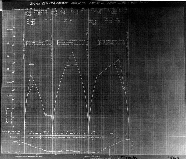
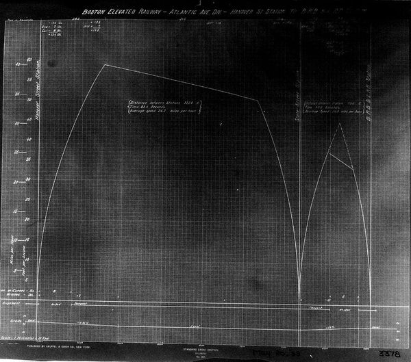
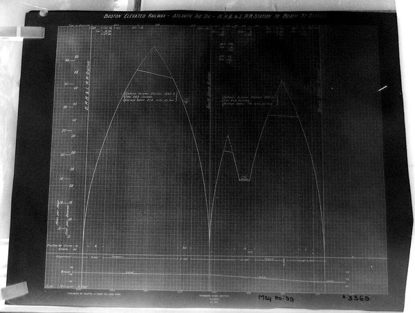
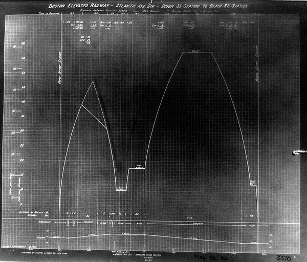
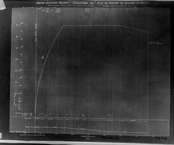
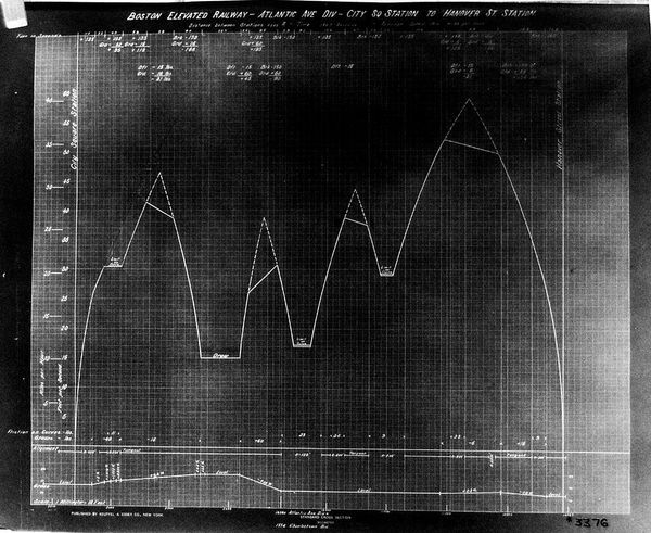
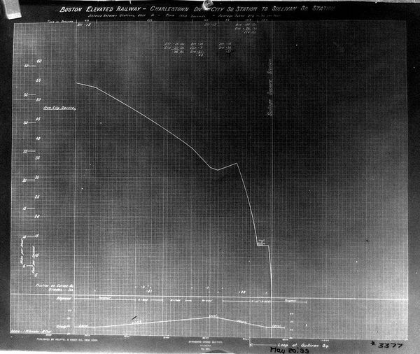
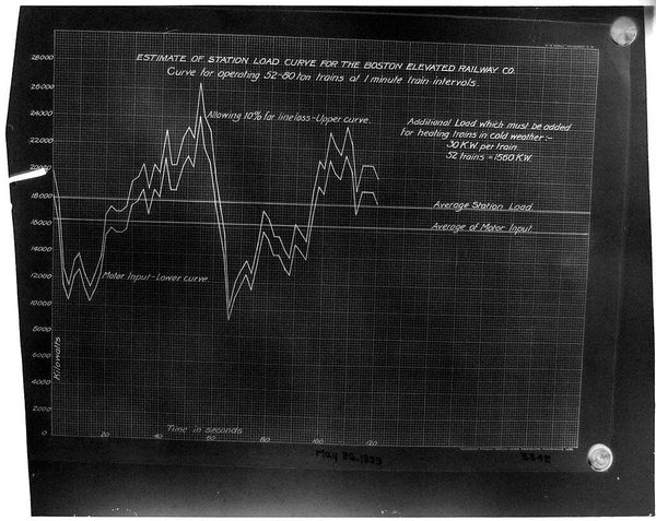
Editor: Here we have Paul Rowell’s "Chart BERy, Subway Div., Pleasant St." It’s quite technical-looking, almost like a blueprint. What does this chart reveal about the development of public transportation in Boston? Curator: It's a fascinating document of urban planning and the politics of infrastructure. These charts weren't just technical; they represented significant investments and decisions impacting communities. Editor: How so? Curator: Think about it: where the subway lines go, how frequently they stop – these choices shaped where people lived, worked, and how easily they could access different parts of the city. It also points to funding and potential displacement. Editor: So, beyond the engineering, this chart tells a story about power and access? Curator: Precisely! It reminds us that even seemingly neutral data visualizations are embedded in social and political realities. Editor: I hadn't considered the socio-political implications of something so technical. Thanks!
Comments
No comments
Be the first to comment and join the conversation on the ultimate creative platform.
More like this