Dimensions: image: 18.8 x 23.2 cm (7 3/8 x 9 1/8 in.)
Copyright: CC0 1.0
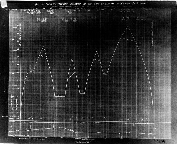
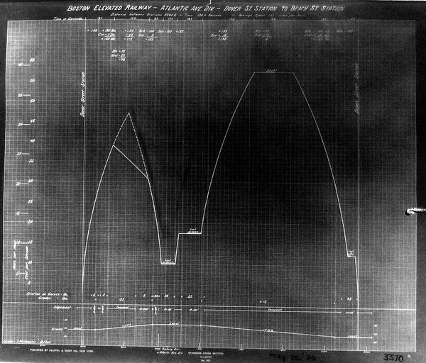
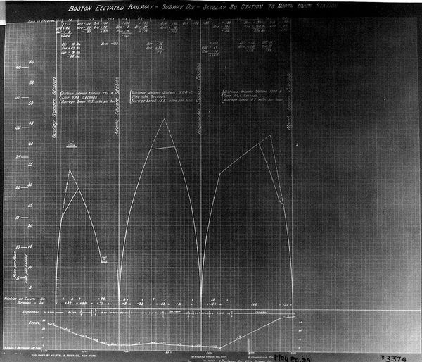
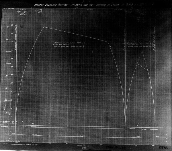
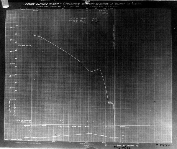
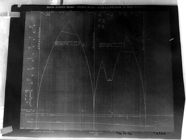
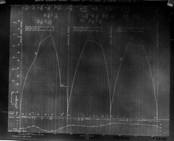
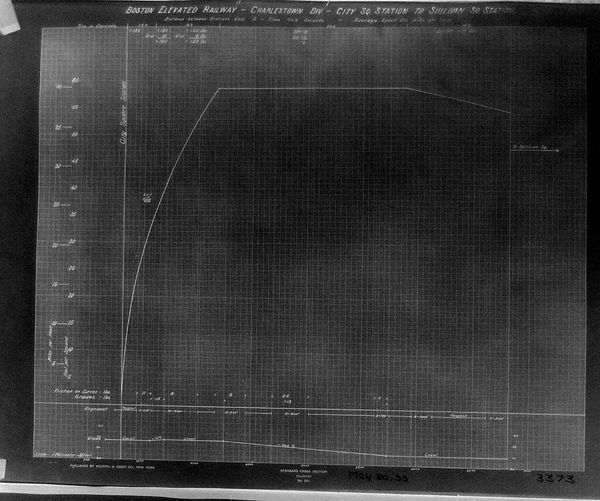
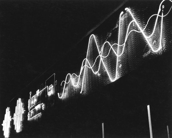
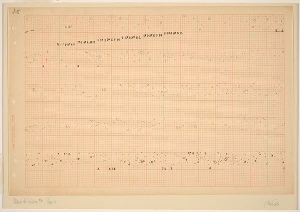
Curator: This chart, created by Paul Rowell, visualizes the electrical load for the Boston Elevated Railway in 1933. It’s fascinating to consider how engineering visualizations like this reflect social priorities. Editor: It's just a graph, but also feels like a time capsule. What does it say about the social priorities of that era? Curator: Well, think about it. This chart prioritizes efficiency for public transit, a critical component of urban life, especially for working-class communities. It tells a story about access and movement. The focus on heating trains also suggests an attempt to improve the passenger experience, regardless of economic status. It's about equity of access, even if imperfect. Editor: So even something as technical as a load curve can be interpreted through a lens of social justice? Curator: Precisely! It's about understanding the systems and infrastructures that shape our lived experiences and how they can be used to promote or hinder equity. Editor: That definitely gives me a new perspective on what constitutes art and its importance.
Comments
No comments
Be the first to comment and join the conversation on the ultimate creative platform.
More like this