print, paper, typography
#
portrait
#
aged paper
#
script typography
#
ink paper printed
# print
#
old engraving style
#
paper
#
typography
#
decorative-art
#
calligraphy
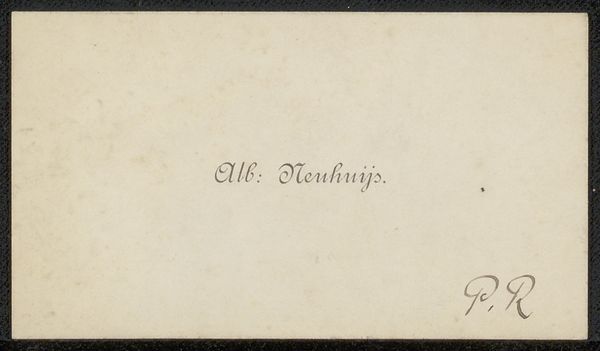
Copyright: Rijks Museum: Open Domain
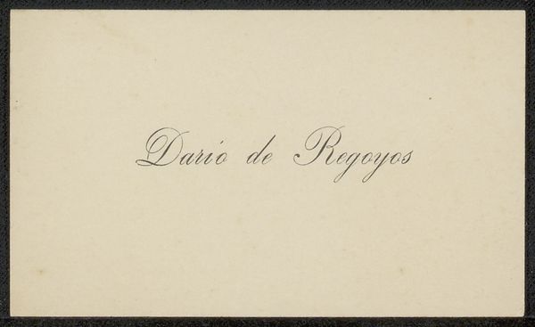
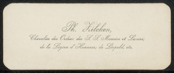
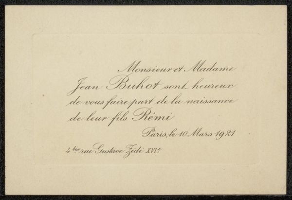
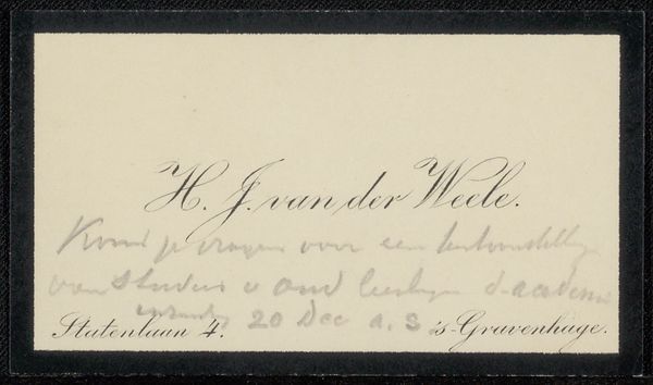
Editor: So, we have here a visiting card addressed to Philip Zilcken, made sometime between 1861 and 1925 by Léon Victor Auguste Bourgeois. It's a print, presumably on paper, with some lovely typography. It seems so simple, yet elegant. What jumps out at you when you see this? Curator: The simplicity itself is quite compelling, isn't it? Think about the social context for this small object. It’s a calling card; an instrument of social exchange. What material practices had to be in place to make a small printed card like this circulate through society? Editor: Material practices? You mean like, printing presses and paper mills? Curator: Exactly! Consider the labour involved. Someone designed the typeface, someone engraved the printing plate, someone else operated the press, and then think about the systems that got it delivered. It suggests a network of making and exchange, each a process and transaction contributing to the social life of the time. Editor: So, you're saying this little card isn't just a greeting, but a snapshot of the era's industrial capacity and labor structures? Curator: Precisely. The elegance you mention is born of those material conditions. The rise of a middle class eager to participate in social circles made this almost a commodity. Editor: It's amazing to think about all the industry tied up in such a small piece of paper. Curator: Absolutely, and how that industrial structure in turn defined social behavior. Editor: I will definitely never look at business cards the same way. Thank you!
Comments
No comments
Be the first to comment and join the conversation on the ultimate creative platform.
More like this