drawing, ink, pen
#
portrait
#
drawing
#
script typography
#
hand-lettering
#
dutch-golden-age
#
hand drawn type
#
feminine typography
#
hand lettering
#
ink
#
hand-drawn typeface
#
thick font
#
pen
#
handwritten font
#
golden font
#
historical font
#
calligraphy
Copyright: Rijks Museum: Open Domain
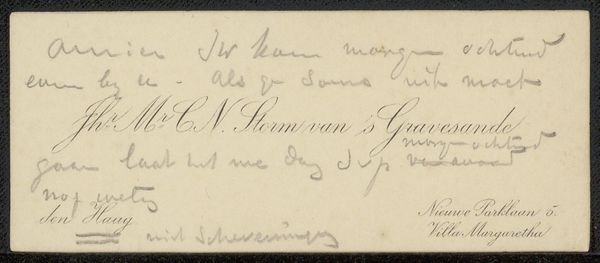
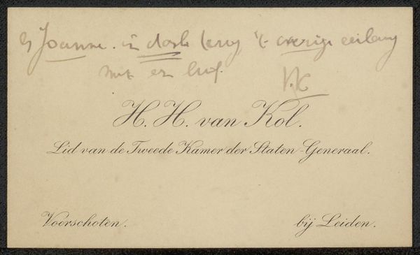
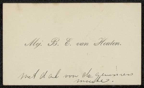
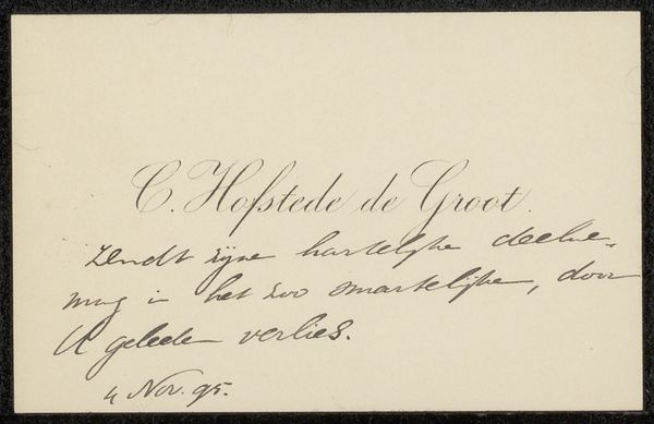
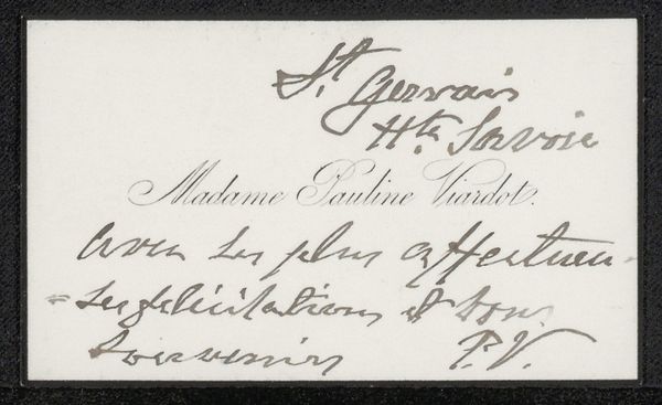
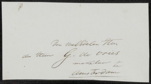
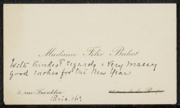
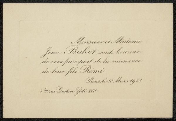
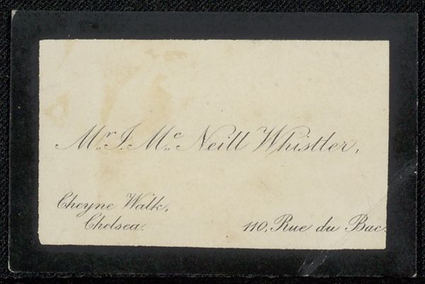
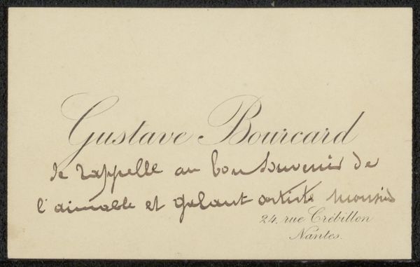
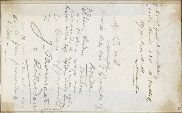
Curator: Here, we have a "Visitekaartje aan Philip Zilcken," or Visiting Card to Philip Zilcken, by Herman Johannes van der Weele, likely made sometime between 1867 and 1930. It’s executed in ink on paper, primarily a drawing but also a fine example of calligraphy. Editor: It’s quite delicate, isn't it? The script has a flowing, almost ethereal quality. The lightness of the grey ink against the creamy paper creates a sense of quiet refinement. Curator: Van der Weele was known as an animal painter, particularly of cattle and sheep, often placed in tranquil landscapes. So, a visiting card like this gives us a fascinating glimpse into another facet of his artistic skill, showcasing a mastery of line and form through lettering rather than pictorial representation. Such cards in that era served a key social function, signifying connection within artistic circles. Editor: Indeed. Consider the careful flourishes and delicate strokes. Calligraphy, historically, wasn't just about conveying information, but embodying status, taste, and refinement. The act of creating such a card would have been imbued with a specific kind of social grace. Curator: Precisely. The handwritten quality, versus printed type, underscores the personal connection, hinting at a social network where personal relations and artistic collaboration went hand in hand. The text itself speaks volumes—the artist's name prominently displayed alongside their address and title within an artistic academy, all signaling membership and participation in the Dutch art world of that period. Editor: And, if you focus on the font, notice how the elegant curves play against the straighter, more formal lines, which lends the piece both a sense of decorum and artistry. The name, especially, seems almost to float on the page, possessing its own aura. It evokes a feeling of being granted access to a certain world, even a specific identity. Curator: Seeing such ephemera brings us closer to the everyday practices that supported artistic life then. How artists navigated social circles, and the role these subtle visual cues played in shaping identities. It is more than a name, but an impression. Editor: Definitely. To see such deliberate strokes and understand the importance of presenting yourself in the best possible way…it makes one appreciate the subtleties of visual communication far beyond words themselves. Curator: Agreed, this visiting card is a perfect, pocket-sized insight into that intricate dance of art, society, and self. Editor: A beautiful little artifact brimming with hidden stories!
Comments
No comments
Be the first to comment and join the conversation on the ultimate creative platform.
More like this