drawing, ink
#
portrait
#
drawing
#
script typography
#
hand-lettering
#
hand drawn type
#
hand lettering
#
personal sketchbook
#
ink
#
hand-drawn typeface
#
fading type
#
thick font
#
handwritten font
#
small lettering
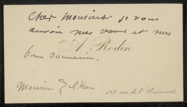
Copyright: Rijks Museum: Open Domain
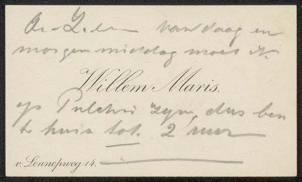
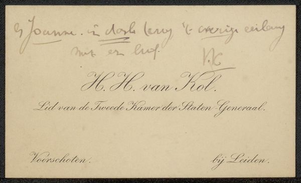
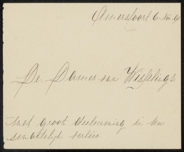
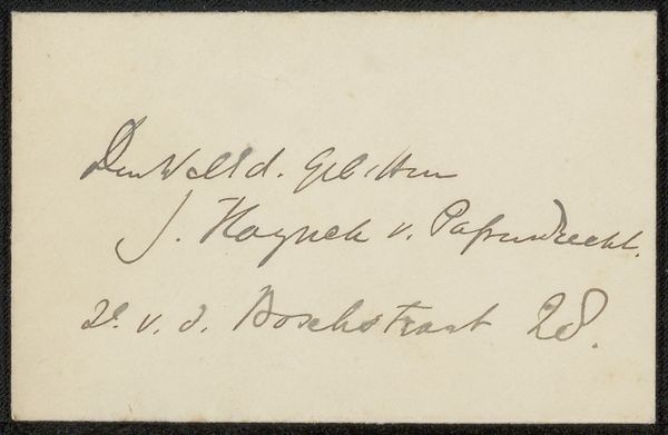
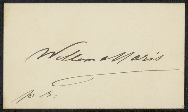
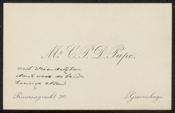
Editor: This is a business card, "Visitekaartje aan Philip Zilcken" by Auguste Rodin, created before 1923. It’s ink on paper. I find the lettering so elegant but also somewhat fading, which gives it a delicate, transient feel. How do you interpret this work? Curator: Well, initially I observe the line itself, the deliberate contrast between the heavier strokes and the delicate hairlines that form the script. This contrast generates a dynamism that enlivens the static form of the card. Do you notice how the flourish of the "A" in "A. Rodin" is almost sculptural in its own right? Editor: Yes, now that you point it out, the A almost balances the script below it. The ink also seems lighter towards the right, creating an asymmetrical fade effect. Is that intentional or a result of aging? Curator: The distribution of the ink, the tonal shifts from dark to light, indeed draw the eye across the surface. Whether that gradation is purely intentional, or partly the effect of time acting on the materials, the interplay enhances the overall composition. Consider also the negative space. How does the stark emptiness of the card’s background contribute? Editor: It definitely emphasizes the handwriting as the main subject and makes it stand out. I'm starting to see how the card’s texture itself contributes to the art, it gives an old, almost precious effect. Curator: Precisely. Through careful arrangement of line, tone and the void, Rodin transforms a utilitarian object into a study of visual equilibrium and textual form. Editor: It's amazing to think about how much can be expressed within the simple framework of a business card through composition alone! Curator: Indeed. It makes one consider the artistic intention embedded even in the seemingly mundane.
Comments
No comments
Be the first to comment and join the conversation on the ultimate creative platform.
More like this