drawing, paper, ink
#
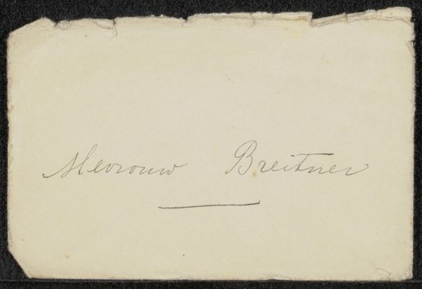
portrait
#
drawing
#
ink paper printed
#
paper
#
ink
#
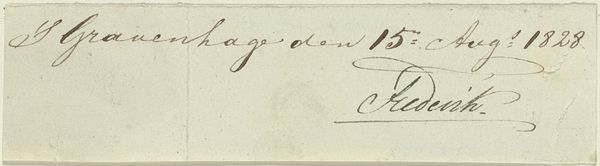
calligraphy
Copyright: Rijks Museum: Open Domain
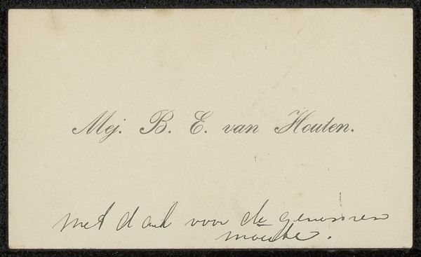
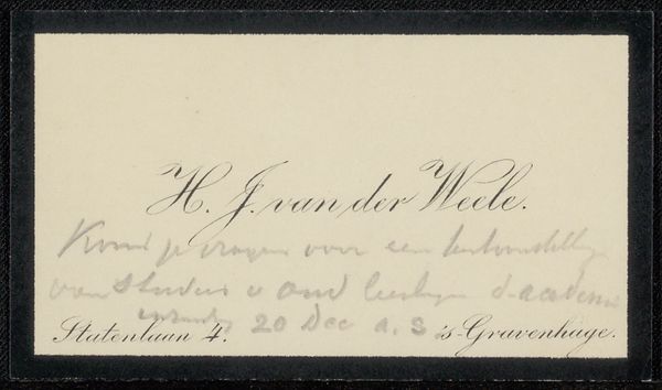
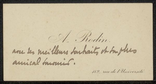
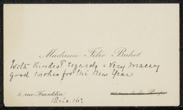
Editor: This is "Visitekaartje aan Philip Zilcken," dating between 1854 and 1914 by Albert Neuhuys, a drawing in ink on paper, here at the Rijksmuseum. It looks like a very delicate and small business card. I am struck by its simple layout. What do you see in it? Curator: Its minimalist structure, comprised of line and plane, is its most compelling feature. The surface is almost entirely unadorned, save for the essential calligraphic inscriptions. The work is about composition and the visual weight given to textual form. What does the card *do* by offering such a bare representation of its function? Editor: It does seem self-consciously sparse. It directs our attention to the lettering, right? Are we supposed to see the contrast between the positive space of the lettering and the negative space of the paper? Curator: Precisely. The interplay of the dark ink against the pale paper establishes a relationship – a dialogue, even. Note the curves of the letters, how they vary in thickness and pressure, creating visual interest that mitigates the work from feeling truly blank or empty. And, what about the lower register? What do *those* glyphs accomplish? Editor: That is right; I did not focus on those elements. They mirror and anchor the text above! Thinking about it as a formal study of simple shapes changes my whole view. Thanks. Curator: Indeed. Form creates content, directing how meaning can be perceived.
Comments
No comments
Be the first to comment and join the conversation on the ultimate creative platform.
More like this