print, paper, typography
#
type repetition
#
aged paper
#
homemade paper
# print
#
hand drawn type
#
paper
#
typography
#
journal
#
fading type
#
stylized text
#
thick font
#
handwritten font
#
columned text
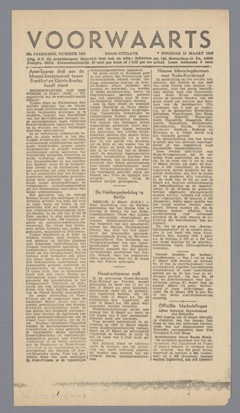
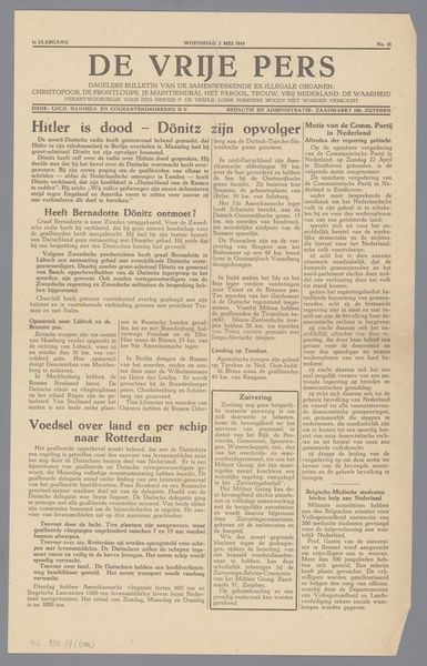
Dimensions: height 38.2 cm, width 29.2 cm
Copyright: Rijks Museum: Open Domain
This is a newspaper called "Voorwaarts" by H.M.C. Schröder. It looks like it was made in February 1945, probably printed with ink on paper. Newspapers. Think of them as a kind of process-oriented art, where each day's edition builds on the last, layering stories and perspectives. Look at the density of the text, like a field of marks, so many little gestures, all accumulating to make a whole. The texture of the paper and the ink creates a tactile experience. You can almost feel the newsprint on your fingertips. A particular headline stands out – something about Hitler. That bold, declarative statement amidst the columns of text really catches the eye. It's a stark reminder of the historical context in which this newspaper was created. It reminds me a little of Kurt Schwitters' collages, where fragments of everyday life are assembled into new forms. Both artists embrace the ephemerality of their materials. Both artists allow ambiguity to thrive, inviting us to question what we see and how we interpret it.
Comments
No comments
Be the first to comment and join the conversation on the ultimate creative platform.
More like this