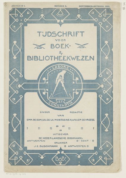
Omslag van: Tijdschrift voor boek- en bibliotheekwezen, 1903 1903
0:00
0:00
graphic-art, typography, poster
#
graphic-art
#
art-nouveau
#
gold leaf
#
typography
#
yellow element
#
golden font
#
decorative-art
#
poster
#
gold element
Dimensions: height 261 mm, width 175 mm
Copyright: Rijks Museum: Open Domain
Reinier Willem Petrus de Vries made this cover for "Tijdschrift voor boek- en bibliotheekwezen" in 1903. It's design, right? With that clean, stylized typeface and decorative border. The print is in this muted olive-green, and the color, along with the simplified shapes, gives it a real graphic punch. Look at the hand holding the compass in the center, so simple but so effective! It's like the essence of design distilled down to its purest form. The whole thing is so flat, yet it has a sense of depth. It's interesting how the lines create a rhythm, a flow that leads your eye around the whole design. And those little dragonfly-looking motifs? A bit whimsical, a bit serious. The Dutch designer H.P. Berlage comes to mind, with his similar attention to detail and structure, and an emphasis on clarity. This cover is about balance, isn't it? But within that balance, there's a lot of room to play. It's a conversation between form and function, simplicity and complexity.
Comments
No comments
Be the first to comment and join the conversation on the ultimate creative platform.
More like this