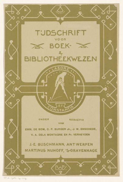
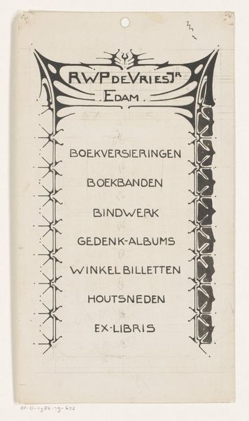
Omslag van: Tijdschrift voor boek- en bibliotheekwezen, september-october 1903 1903
0:00
0:00
graphic-art, print, typography, poster
#
graphic-art
#
art-nouveau
# print
#
typography
#
poster
Dimensions: height 275 mm, width 191 mm, width 375 mm
Copyright: Rijks Museum: Open Domain
Curator: Immediately striking is the serene coolness of this work, rendered in such a limited palette. The crispness of the pale blue lines against the ivory background evokes a sense of quiet intellect. Editor: You're looking at "Omslag van: Tijdschrift voor boek- en bibliotheekwezen, september-october 1903," or "Cover of: Journal for Book and Library Affairs, September-October 1903." It's a striking example of graphic art and typography, specifically a print in the Art Nouveau style, attributed to Reinier Willem Petrus de Vries. Curator: And those intertwined lines! Classic Art Nouveau, echoing nature’s flowing forms, yet here with a restraint, almost mathematical, that speaks to the journal's subject. I see symbolic echoes of craft guilds—a reverence for both handwork and intellectual rigor. Editor: Look closely at the central emblem. Notice the pair of compasses, an enduring symbol of architecture, geometry, and, by extension, reasoned construction and knowledge itself. Below, "Labore et Constantia," labor and steadfastness, a maxim perfectly fitting a scholarly pursuit. These are icons celebrating not just reading, but creation. Curator: Precisely! The artist weaves in a sense of cultural memory, reminding the viewer that librarianship, documentation, the entire book trade is an active cultural pursuit of order from chaos—of maintaining shared cultural history. The careful repetition of small geometric motifs in the border further underscores the diligence needed. Editor: It's interesting how those motifs are not *quite* perfect. There are tiny imperfections and variations, subtly betraying the human hand in the design, adding warmth, maybe fighting against the rigid formalism suggested by the title design. Curator: Yes, and that humanity acts like an antidote against the possible pretension inherent in elevating books to such monumental status. It reveals the work is about *people's* pursuit of knowledge, not the cold abstraction of knowledge. Editor: Looking at it this way, I find this graphic surprisingly comforting. It celebrates not just what's inside books, but *our* investment in their endurance. Curator: Agreed. There's something deeply resonant about this simple cover—a testament to the enduring power of printed knowledge, rendered with a deceptively simple artistry that elevates form to meaningful content.
Comments
No comments
Be the first to comment and join the conversation on the ultimate creative platform.
More like this