#
abstract expressionism
#
sky
#
abstract painting
#
impressionist painting style
#
house
#
impressionist landscape
#
possibly oil pastel
#
fluid art
#
acrylic on canvas
#
paint stroke
#
water
#
watercolour bleed
#
watercolor
#
building
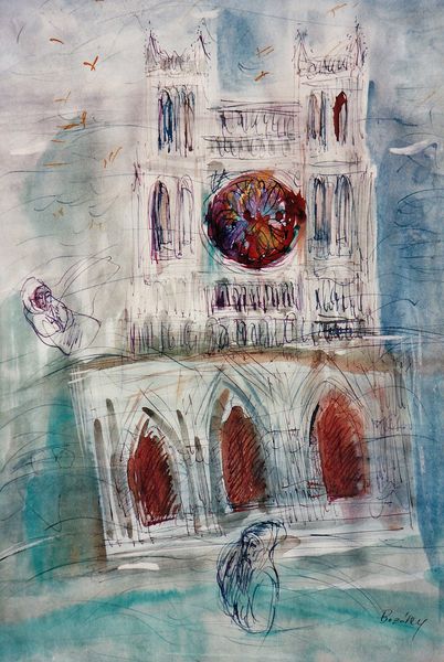
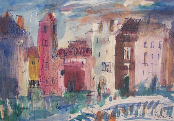
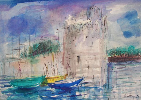
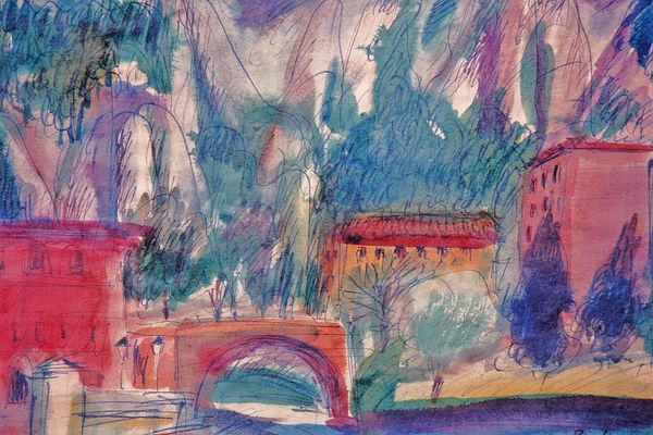
Dimensions: 29 x 41 cm
Copyright: Maria Bozoky,Fair Use
Maria Bozoky made these 'Houses in Venice' using what looks like watercolor and pen, maybe? The marks are loose, immediate, not fussy at all. You get the feeling she was working quickly, trying to capture a feeling, a memory, a mood. I’m drawn to the way the blue of the water bleeds into the buildings, dissolving the boundaries between things. It's all kind of one big blur of color and line. I love the scribble-y lines that define the architecture – they’re not precise, but they give you a sense of the place. There's one particular dark line that defines the archway on the building in the center of the picture. It's so simple, but it holds everything together. Bozoky reminds me a bit of Joan Mitchell, you know, in the way she uses color and gesture to evoke a sense of place. Both artists have that ability to make you feel like you’re right there, even though the image is totally abstract. I think it's a good reminder that art is never really finished, it's more about the process of seeing and feeling.
Comments
No comments
Be the first to comment and join the conversation on the ultimate creative platform.
More like this