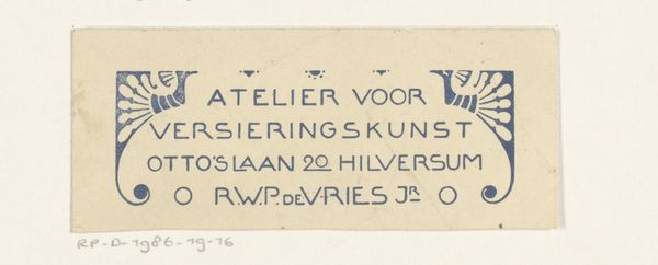
Ontwerp voor een briefhoofd van Cursus Holthuizen 1884 - 1952
0:00
0:00
drawing, graphic-art, paper, typography, ink
#
drawing
#
graphic-art
#
art-nouveau
#
script typography
#
hand-lettering
#
lettering
#
hand drawn type
#
hand lettering
#
paper
#
typography
#
ink
#
hand-drawn typeface
#
fading type
#
thick font
#
handwritten font
#
small lettering
Dimensions: height 109 mm, width 219 mm
Copyright: Rijks Museum: Open Domain
Reinier Willem Petrus de Vries made this design for a letterhead using ink on paper, but I can’t tell you exactly when. What's fascinating here is the evidence of the artist's hand, the way the ink pools and thins, creating a rhythm of dark and light across the page. The texture is crucial; you can almost feel the nib of the pen dragging across the paper, a very physical, deliberate act. Look at the repeated use of the word ‘Cursus’ at the bottom. Each iteration is slightly different, each a testament to the unpredictable nature of the medium and the process. It's as though de Vries is testing the word, seeing how it feels to write it again and again. This connects to a broader idea of art making as a journey, an exploration without a fixed destination. De Vries's contemporary, Jan Toorop, had a similar interest in typography and graphic design. Like Toorop, de Vries seems to embrace the imperfections, allowing them to become part of the artwork's unique character and allowing for various interpretations.
Comments
No comments
Be the first to comment and join the conversation on the ultimate creative platform.
