About this artwork
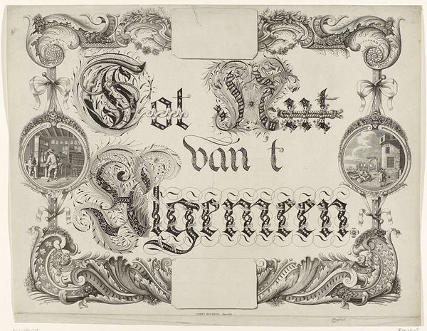
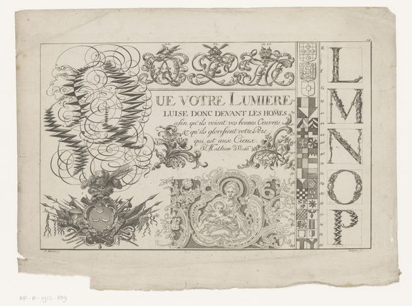
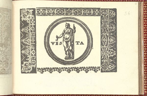
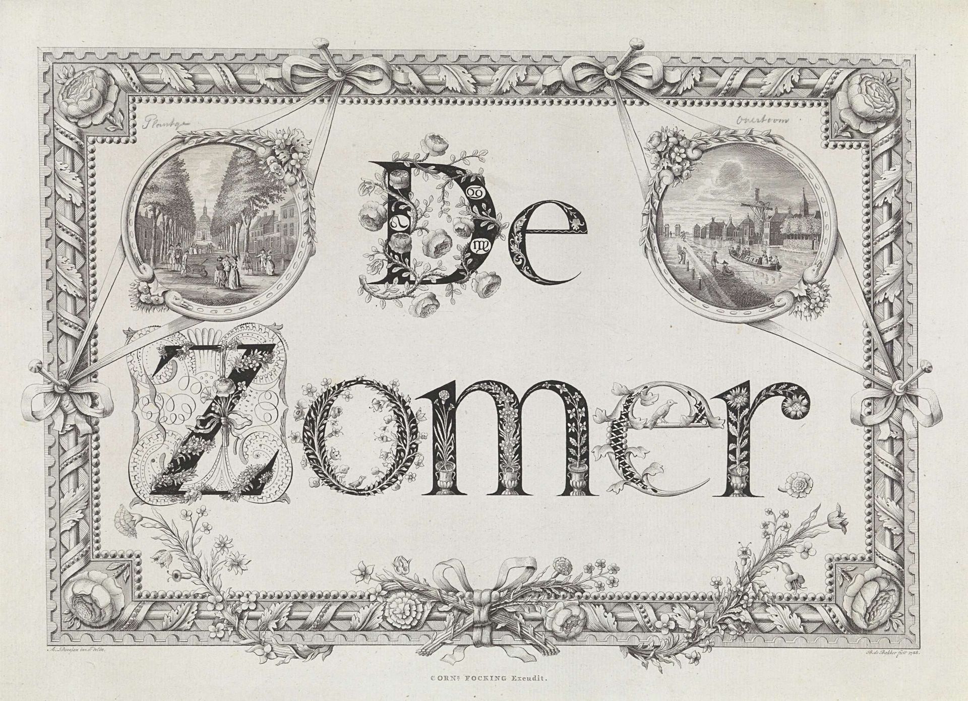
Curator: It's giving me illuminated manuscript vibes, but make it Dutch Golden Age. Editor: You’ve keyed right into something there! What we’re looking at is a print called "Rechthoekige omlijsting met bladornamenten en bloemen voor de Zomer en medaillons met gezichten op de Plantage en de Overtoom te Amsterdam." It's attributed to Barent de Bakker, and while the dating is imprecise, it was likely made sometime between 1762 and 1804. Curator: Right, it is an engraving. But those dense floral letters framing what I presume are Amsterdam cityscapes...there's something playful and nostalgic about the way it presents information. It almost reads as pure decoration, blurring function with visual delight. Editor: Exactly. I see it as a celebration of both summer and the city. Look at how the typography itself embodies this: the letters bloom, vines twist. This isn't just conveying "summer;" it's performing it visually. And in those small medallion views of Plantage and Overtoom, we're getting glimpses of Amsterdam life—a slice of local experience immortalized and prettified. Curator: The floral arrangements feel almost allegorical to me. The entire design pulses with vitality, symbolizing prosperity, bounty. This goes beyond decoration—it visually echoes classical ideas of Summer. Editor: Perhaps De Bakker saw those particular locations, Plantage and Overtoom, as epitomes of the summer experience in Amsterdam? There’s that lovely implied link—Summer distilled, made local, all interwoven. It creates a kind of…contained world, doesn't it? The boundaries are clearly marked by those floral borders, so intricate and deliberate. Curator: It evokes a kind of... ideal. Not necessarily a realistic snapshot, but an enhanced, almost mythic rendering. You almost expect nymphs and satyrs to come bursting from behind the foliage. It’s summer according to the wealthy burghers of Amsterdam. Editor: The craftsmanship is gorgeous and yes, idyllic, not only literally marking the summer season but visually encoding its symbolic values as well. There’s an invitation there, isn't there—to remember, to experience, maybe even to idealize summer memories.
Rechthoekige omlijsting met bladornamenten en bloemen voor de Zomer en medaillons met gezichten op de Plantage en de Overtoom te Amsterdam
1762 - 1804
Barent de Bakker
@barentdebakkerLocation
RijksmuseumArtwork details
- Medium
- drawing, graphic-art, print, typography, ink, engraving
- Dimensions
- height 290 mm, width 398 mm
- Location
- Rijksmuseum
- Copyright
- Rijks Museum: Open Domain
Tags
Comments
Share your thoughts
About this artwork
Curator: It's giving me illuminated manuscript vibes, but make it Dutch Golden Age. Editor: You’ve keyed right into something there! What we’re looking at is a print called "Rechthoekige omlijsting met bladornamenten en bloemen voor de Zomer en medaillons met gezichten op de Plantage en de Overtoom te Amsterdam." It's attributed to Barent de Bakker, and while the dating is imprecise, it was likely made sometime between 1762 and 1804. Curator: Right, it is an engraving. But those dense floral letters framing what I presume are Amsterdam cityscapes...there's something playful and nostalgic about the way it presents information. It almost reads as pure decoration, blurring function with visual delight. Editor: Exactly. I see it as a celebration of both summer and the city. Look at how the typography itself embodies this: the letters bloom, vines twist. This isn't just conveying "summer;" it's performing it visually. And in those small medallion views of Plantage and Overtoom, we're getting glimpses of Amsterdam life—a slice of local experience immortalized and prettified. Curator: The floral arrangements feel almost allegorical to me. The entire design pulses with vitality, symbolizing prosperity, bounty. This goes beyond decoration—it visually echoes classical ideas of Summer. Editor: Perhaps De Bakker saw those particular locations, Plantage and Overtoom, as epitomes of the summer experience in Amsterdam? There’s that lovely implied link—Summer distilled, made local, all interwoven. It creates a kind of…contained world, doesn't it? The boundaries are clearly marked by those floral borders, so intricate and deliberate. Curator: It evokes a kind of... ideal. Not necessarily a realistic snapshot, but an enhanced, almost mythic rendering. You almost expect nymphs and satyrs to come bursting from behind the foliage. It’s summer according to the wealthy burghers of Amsterdam. Editor: The craftsmanship is gorgeous and yes, idyllic, not only literally marking the summer season but visually encoding its symbolic values as well. There’s an invitation there, isn't there—to remember, to experience, maybe even to idealize summer memories.
Comments
Share your thoughts