Dimensions: height 310 mm, width 417 mm
Copyright: Rijks Museum: Open Domain
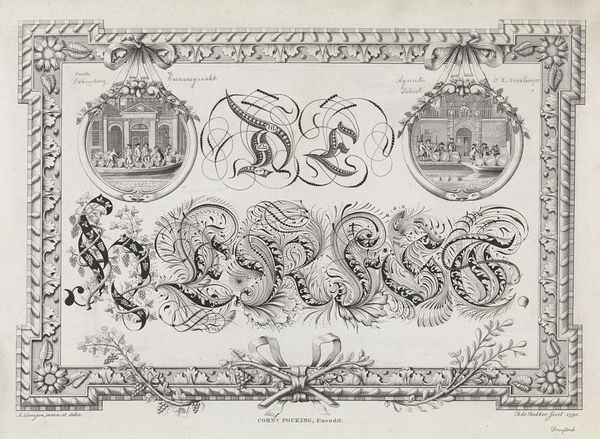
Editor: Here we have "Calligraphy of the province of Holland," an engraving from around 1790 by Cornelis van Baarsel. It's incredibly intricate! All these swirling, decorative elements surrounding the word "Holland" give it a real sense of pride and importance. What catches your eye when you look at it? Curator: The obvious grandeur speaks to the symbolic importance that Holland held during this period, but it’s more than just a pretty picture. Consider the lion rampant at the top, a symbol of courage and royalty that’s been associated with the Dutch for centuries. How does its placement above the calligraphy impact your reading of the artwork? Editor: It definitely adds to that feeling of authority. I also notice the little vignettes to either side of the word; one's an architectural scene, the other a ship at sea. Curator: Exactly! Those vignettes act as visual anchors, connecting the province to its key strengths: trade and civic pride. Think of these images as visual metaphors for the province's identity, reinforcing its cultural narrative through widely recognized symbols. How might repeated visual markers build, reinforce, and celebrate power and memory? Editor: That's fascinating! So it's like… by constantly showing these symbols, they solidify Holland's importance in people's minds. It makes you wonder what symbols define places today. Curator: Precisely! The power of symbolic representation remains incredibly relevant, though our symbols might manifest through different media today. What do you make of that visual link now? Editor: I never really thought about how consciously these things were constructed. Looking at art with its symbols demystified shows you a glimpse of the intention. Curator: Indeed! Analyzing such artworks allows us to unravel how cultural memory is woven through visual language.
Comments
No comments
Be the first to comment and join the conversation on the ultimate creative platform.
More like this