About this artwork
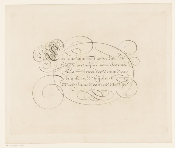
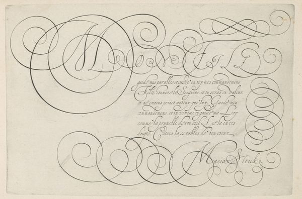
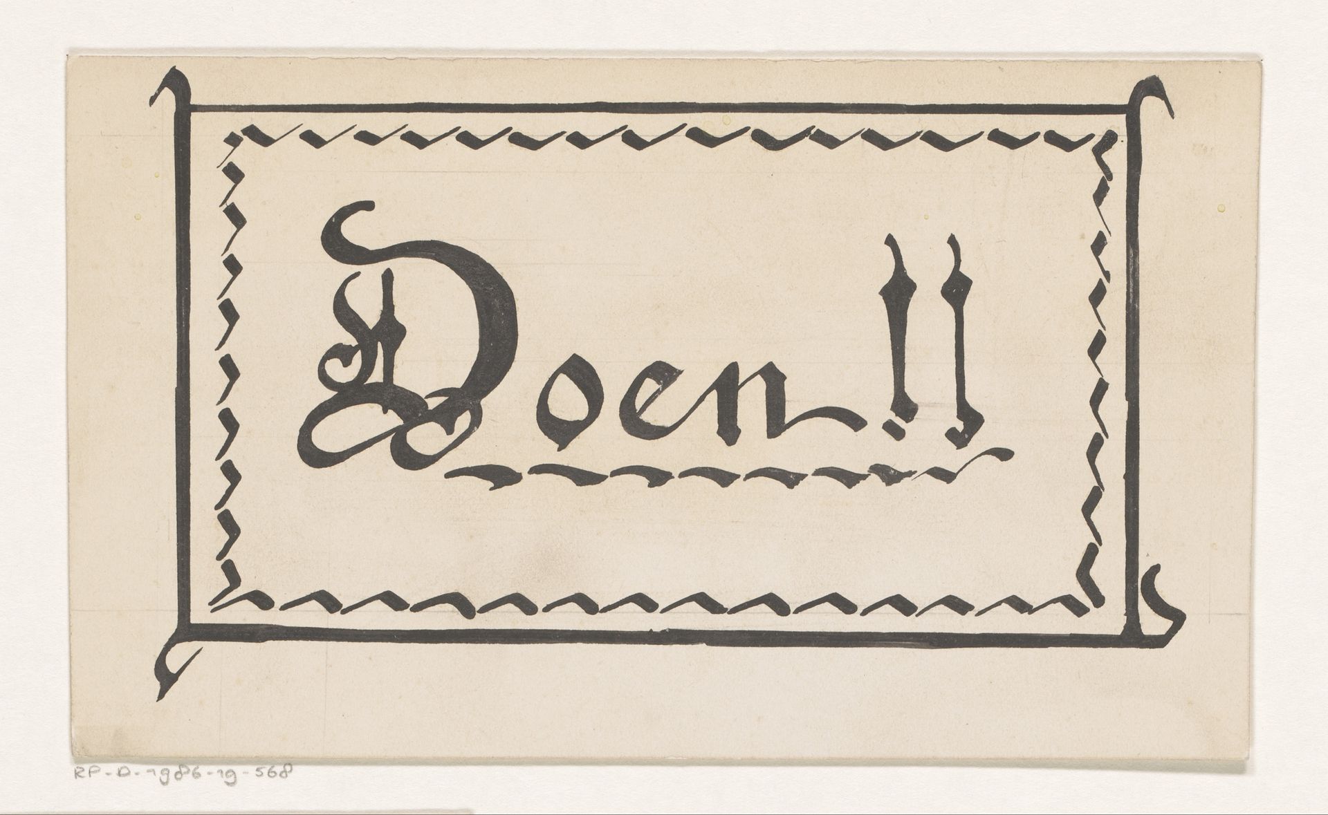
This is "Tekstkader" by Reinier Willem Petrus de Vries, and it looks like it's made with ink on paper, it is difficult to date precisely, but based on the artist's lifetime it probably dates to the first half of the twentieth century. The way de Vries approaches the lettering and the border around it, you can tell that mark-making is at the heart of the process. It is all about bold lines and a confident hand. The ink is pretty opaque and you can tell it has been applied with a brush, probably a small one, or perhaps even a reed or quill. I love the little zig-zag border. It’s almost like a heartbeat, pulsing around the text. The lettering is really expressive, that 'D' is so flamboyant and sort of playful, like it's trying to escape the frame! Overall the work reminds me a little of Paul Klee's playful explorations of writing and image, but here the emphasis is clearly on the graphic quality of the inscription. Ultimately, like so much great art, its beauty lies in its ambiguity.
Artwork details
- Medium
- drawing, paper, typography, ink
- Dimensions
- height 101 mm, width 170 mm
- Copyright
- Rijks Museum: Open Domain
Tags
Comments
Share your thoughts
About this artwork
This is "Tekstkader" by Reinier Willem Petrus de Vries, and it looks like it's made with ink on paper, it is difficult to date precisely, but based on the artist's lifetime it probably dates to the first half of the twentieth century. The way de Vries approaches the lettering and the border around it, you can tell that mark-making is at the heart of the process. It is all about bold lines and a confident hand. The ink is pretty opaque and you can tell it has been applied with a brush, probably a small one, or perhaps even a reed or quill. I love the little zig-zag border. It’s almost like a heartbeat, pulsing around the text. The lettering is really expressive, that 'D' is so flamboyant and sort of playful, like it's trying to escape the frame! Overall the work reminds me a little of Paul Klee's playful explorations of writing and image, but here the emphasis is clearly on the graphic quality of the inscription. Ultimately, like so much great art, its beauty lies in its ambiguity.
Comments
Share your thoughts