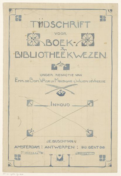
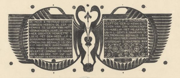
Ontwerp voor de portefeuille van: Jan Veth, Jozef Israëls en zijn kunst, 1904 1904
0:00
0:00
drawing, graphic-art, paper, typography, ink
#
drawing
#
graphic-art
#
art-nouveau
#
paper
#
typography
#
ink
#
decorative-art
Dimensions: height 222 mm, width 273 mm
Copyright: Rijks Museum: Open Domain
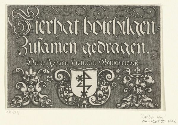
Editor: This drawing, "Ontwerp voor de portefeuille van: Jan Veth, Jozef Israëls en zijn kunst", which translates to 'Design for the portfolio of Jan Veth, Jozef Israels and his art,' dates back to 1904 and is by Reinier Willem Petrus de Vries. It seems to be an ink drawing on paper, exploring typography within a decorative, Art Nouveau frame. I’m really drawn to its understated elegance. What catches your eye about its composition? Curator: The restrained palette of browns immediately strikes me. Note how the artist employed ink not for shading or modeling, but to define forms and articulate a surface pattern. The lines create a symmetrical enclosure around the text, reinforcing the two distinct sections. The interplay of geometric forms, along with the curvilinear flourishes typical of Art Nouveau, work harmoniously to control the design’s movement. Do you see how these elements combine? Editor: Yes, the symmetry definitely provides structure. But it is not exactly perfect symmetry; there are asymmetrical subtleties that bring nuance. The Art Nouveau details soften it, which keeps it from feeling too rigid. Do you read into the artist’s choices of font and framing device? Curator: Typography here goes beyond legibility, it also sets the aesthetic tone. Look at the customized letterforms within that asymmetrical-symmetrical framework, reflecting not just information but mood. Each element appears deliberately weighted and placed. How do you think that shapes the viewer’s reception of Jozef Israëls? Editor: That's interesting to consider. Seeing the typography and Art Nouveau influences in this context makes me appreciate the artist's intentions and process even more. Thanks, that really helps! Curator: Indeed, this exploration proves that the success of art lies not only in the visual details, but in how we interpret its compositional language.
Comments
No comments
Be the first to comment and join the conversation on the ultimate creative platform.
More like this