graphic-art, print, textile, typography, poster
#
graphic-art
#
art-nouveau
# print
#
textile
#
typography
#
poster
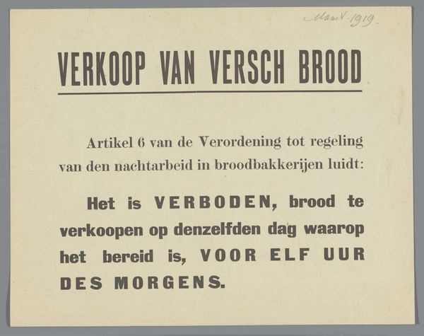
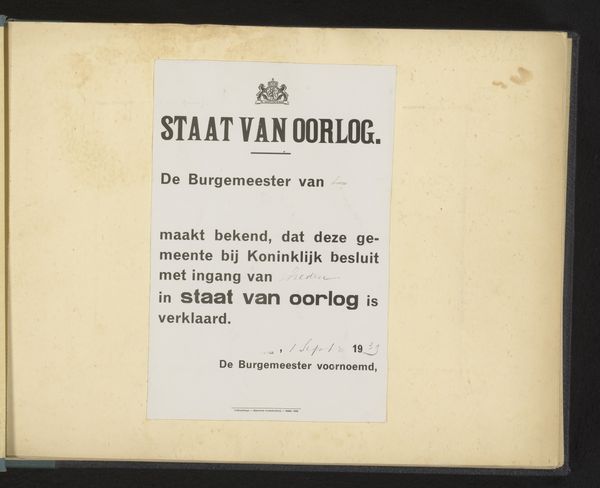
Dimensions: height 26.5 cm, width 20.7 cm
Copyright: Rijks Museum: Open Domain
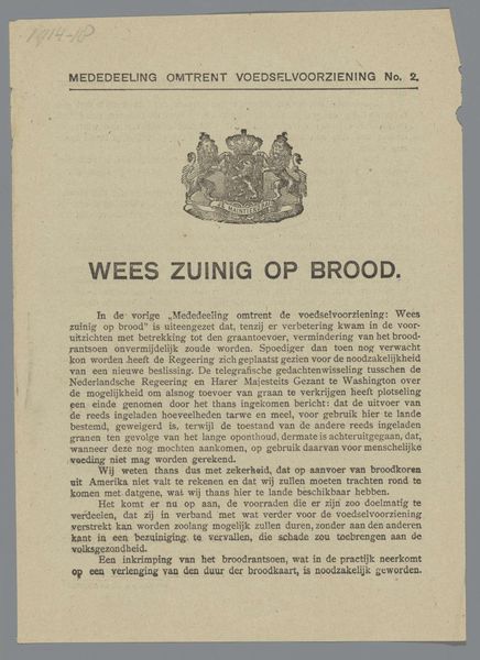
This public notice by Gemeentebestuur van Amsterdam, probably printed, decrees that you can’t sell fresh bread before eleven in the morning. It’s kind of like a painting, if you think about the choices made in its production. Take the font – blocky and serious, it shouts a command. The ink, maybe a dark sepia, is solid and contrasts with the off-white of the page. You can almost smell the paper. I imagine the texture is smooth, not fibrous. I like to zoom in and look really closely at the letters, feeling like I’m watching a story unfold. And think about the printing press. So much pressure involved! It reminds me of the posters that Barbara Kruger makes, but with a different intention. Where Kruger is playing with advertising, this is simply a sign of the times. It's interesting to consider how our relationship with these types of documents changes over time. What was once a directive is now an historical artifact.
Comments
No comments
Be the first to comment and join the conversation on the ultimate creative platform.
More like this