graphic-art, print, typography, poster
#
graphic-art
#
type repetition
#
aged paper
#
homemade paper
# print
#
typeface
#
editorial typography
#
hand drawn type
#
typography
#
fading type
#
stylized text
#
thick font
#
classical type
#
poster
#
modernism
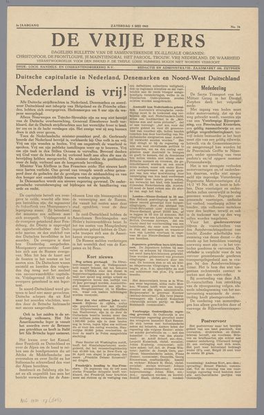
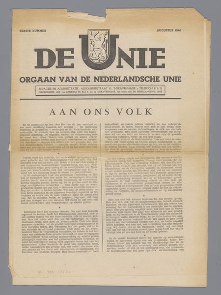
Dimensions: height 38.5 cm, width 28 cm
Copyright: Rijks Museum: Open Domain
Curator: This print, “De Unie,” possibly dating from the period of 1941-1947, immediately grabs my attention with its bold, assertive typography. Editor: It's undeniably striking. The sheer repetition of the title—"De Unie," meaning "The Union"—gives it a weight, almost a sense of propaganda. What's the context here? Curator: “De Unie,” or the Nederlandsche Unie, was a Dutch political movement that briefly gained massive popularity during the German occupation. Note how the typeface itself seems aged, classical, almost trying to project an aura of established authority. Editor: Precisely. And this appeals to my activist sensibilities because "authority" in this context is deeply problematic. It arose as a supposedly moderate alternative to the NSB, the Dutch Nazi party, but its goals of national unity risked normalizing collaboration with the occupiers. The visual language contributes to that slippery slope. Curator: But consider the historical moment. The Dutch population yearned for a sense of continuity, something familiar amidst the chaos. The very deliberate hand-drawn style of the type, what you might call "editorial typography," speaks to a desire for order and tradition. Look closely: it appears on homemade paper, maybe scarce given wartime austerity? Editor: A homemade aesthetic used in the service of a nationalist message doesn’t sit well. The stylised text feels deliberate. There is, undeniably, something stirring in this fading type, yet I am suspicious of its purpose in contributing to a national fantasy that blurs ethical lines when resistance was most needed. Curator: It certainly prompts necessary discussions about national identity during wartime, especially its symbols and appeals. Even in typography choices, we can uncover layers of meaning. Editor: Exactly, which is why analyzing art like “De Unie” isn't just an exercise in style. It compels us to confront uncomfortable truths about complicity, resilience, and the visual strategies of persuasion.
Comments
No comments
Be the first to comment and join the conversation on the ultimate creative platform.
More like this