paper, typography, poster
#
script typeface
#
aged paper
#
homemade paper
#
script typography
#
dutch-golden-age
#
hand drawn type
#
paper
#
typography
#
fading type
#
stylized text
#
thick font
#
classical type
#
poster
#
historical font
#
calligraphy
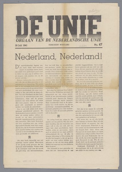
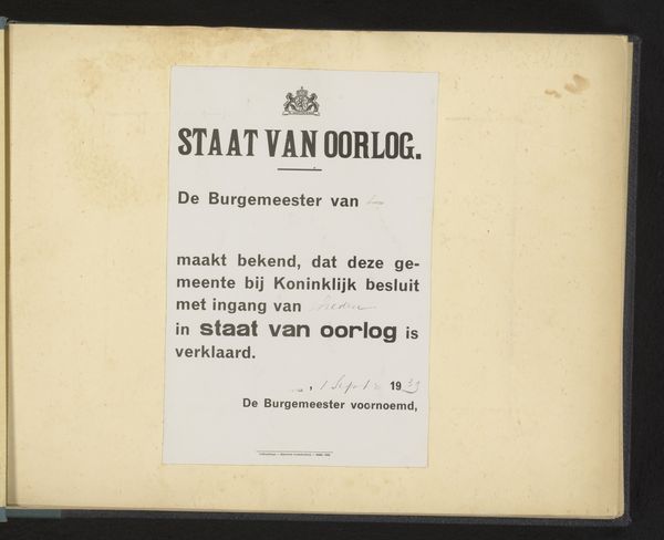
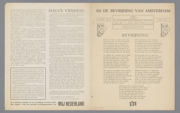
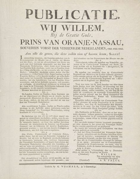
Dimensions: height 38.5 cm, width 28 cm
Copyright: Rijks Museum: Open Domain
Curator: The work we are viewing is called "De Unie," a poster from between 1940 and 1948 connected with the Nederlandsche Unie movement. The script typography is quite striking. Editor: Immediately, I'm struck by its aged quality. The paper itself looks fragile, hinting at the turbulent historical context it emerged from. There's a melancholy feeling to it, don’t you think? Curator: Yes, the aging is part of its material story, telling of scarcity and limited resources. Given the German occupation of the Netherlands, the choice of paper would've been deeply implicated in material constraints. And the heavy black ink, quite characteristic of wartime printing, would be whatever was available, no room for artistic affectation there. Editor: Exactly. Consider that the Nederlandsche Unie emerged as a response to the occupation, aiming for national unity. That stylized text becomes an act of resistance in its own way. Each printed sheet circulated amongst citizens became an object loaded with political and social implications in defiance of occupation. Curator: I’m very intrigued by that thick, hand-drawn typography. It reflects the skill involved, the labour of laying out these posters. I suspect someone intimately familiar with printing techniques oversaw this piece. Editor: The historical font really jumps out too! Think of the act of disseminating information in that context – each poster, each carefully lettered word, a beacon in a time of censorship and oppression. The script, though aged now, would have had profound political implications for all who could access the document. Curator: It reminds us that graphic design can be a tool—a practical application and record of collective action. A critical approach helps us recognise the material limits that define art's existence. Editor: And contextualising helps see its emotional weight as both a cry for unity and subtle opposition to the status quo. What we now see as type carries the charge of historical resistance. Curator: Indeed. Seeing the craft behind "De Unie" deepens our grasp of art as a form of labour. Editor: Absolutely. This is much more than ink on paper—it is evidence, material trace of struggle.
Comments
No comments
Be the first to comment and join the conversation on the ultimate creative platform.
More like this