graphic-art, print, typography
#
graphic-art
# print
#
typography
Dimensions: height 45 cm, width 30 cm
Copyright: Rijks Museum: Open Domain
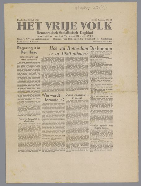
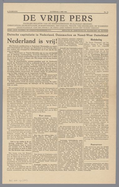
Curator: At first glance, this is a fairly conventional newspaper layout. The density of the typography is quite overwhelming! Editor: This is "De Volkskrant," possibly from 1945. As a Catholic daily newspaper for the Netherlands, its significance extends far beyond mere newsprint. Curator: How so? The composition—or rather, its relentless uniformity—doesn't suggest anything visually striking to me. It’s all blocks of text. Editor: But consider the date, likely just after the liberation of the Netherlands. Newspapers like this served as vital tools in shaping public opinion, rebuilding national identity, and, importantly, providing information in a time of great uncertainty and change. The very act of publishing was a political statement. Curator: I see what you mean, now—knowing the social context frames the object. However, the typography itself doesn't communicate such depth—it’s standard, functional…utilitarian. I find it quite mundane from a formal standpoint. Editor: But look closer at the masthead! "De Volkskrant" in bold—a strong declaration of identity. And the subtitle, "Catholic Daily Newspaper for the Netherlands"—a clear positioning within the cultural landscape. Curator: Good points. Its bold aesthetic, like a call to attention is something hard to dismiss as simply “utilitarian”. Still, without that cultural backstory you paint, I wouldn't grasp the design's weight. Editor: Precisely. The graphic elements and the textual content come together to form a very direct message. Every aspect served a purpose in this historical and cultural context. A newspaper then, but more than the news. Curator: Thanks—now it's a layered subject with narrative! Editor: Always remember context shapes meaning!
Comments
No comments
Be the first to comment and join the conversation on the ultimate creative platform.
More like this