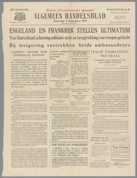
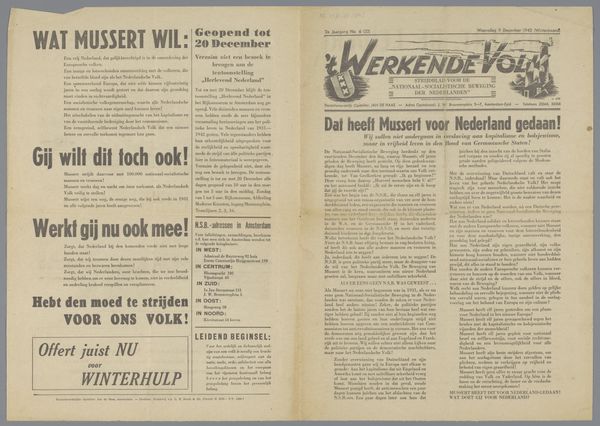
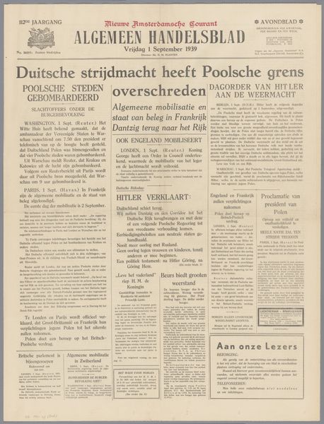
print, paper, typography
# print
#
paper
#
typography
#
modernism
Dimensions: height 38.5 cm, width 28 cm
Copyright: Rijks Museum: Open Domain
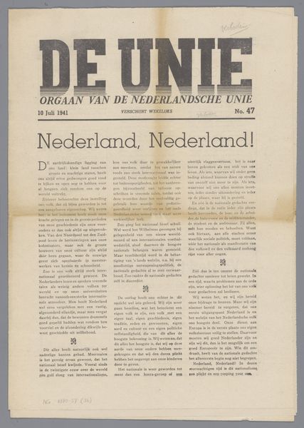
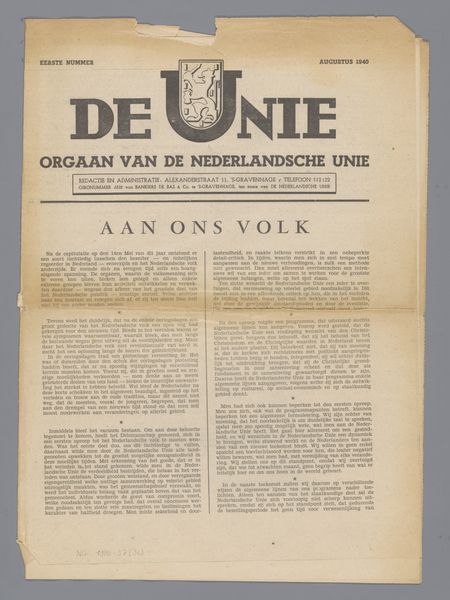
This is a newspaper from 1941 called De Unie, made by the Nederlandsche Unie. It’s printed in shades of grey, on paper that has aged and browned like old leaves. The ink sits on the surface, not quite soaking in, so that you can feel the texture if you run your fingers across it. The layout is dense with text, a solid block of information and instruction. And just like when I'm building up layers of paint, sometimes the most powerful statements emerge from the accumulation of small details. Look closely at the letters in the title – DE UNIE – a strong, blocky sans-serif font. Each letter is carefully constructed, yet there are slight imperfections, a little blur around the edges, like it was done quickly, and is already starting to decay. I'm also reminded of some of the graphic design work by El Lissitzky and other Russian Constructivists, who sought to use abstract forms and typography to create a new visual language for a revolutionary age. Art isn't created in a vacuum; it always echoes with the voices of those who came before.
Comments
No comments
Be the first to comment and join the conversation on the ultimate creative platform.
More like this