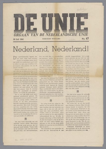
't Werkende Volk. Strijdblad voor de "Nationaal-socialistische beweging der Nederlanden" Possibly 1942
0:00
0:00
graphic-art, print, typography, poster
#
graphic-art
#
aged paper
#
dutch-golden-age
# print
#
editorial typography
#
typography
#
journal
#
poster
Dimensions: height 413 mm, width 292 mm
Copyright: Rijks Museum: Open Domain
Editor: We’re looking at “'t Werkende Volk. Strijdblad voor de "Nationaal-socialistische beweging der Nederlanden"” which translates to "The Working People. Battle Newspaper for the "National Socialist Movement of the Netherlands," a poster or perhaps a journal cover from possibly 1942 by Jan de Haas. It's a piece of editorial typography, printed. The starkness and the typeface give it such a severe, almost aggressive feel. What's your take? Curator: Aggressive is spot on. That direct, almost confrontational tone leaps right out, doesn't it? It's fascinating, unsettling even, how typography alone can become a weapon. But think about the intended audience. Who do you imagine they were trying to reach with this propaganda? Do you think the paper itself looked worn and yellow when published, as it does now? Editor: Presumably, the Dutch working class who were sympathetic to the Nazi ideology. I would imagine it would have looked very striking and new to attract followers. Now, it just looks dated and old, perhaps losing its impact. How did the "Dutch Golden Age" affect work like this one, since it is one of its described styles? Curator: Interesting question. Its invocation seems deliberately perverse. What elements do you recognize from Dutch Golden Age art, and how are they deployed here? Editor: Well, the Golden Age was known for its realism and depictions of everyday life. This… appropriates that sense of "the people," but twists it into a tool for political manipulation. It is not actually like golden age painting in terms of rendering style, but references it more loosely in ideal. What a dark perversion. Curator: Precisely! A visual echo, warped for a sinister purpose. See how knowing the history – both artistic and political – changes the way you see it? I came in thinking the art was uninteresting, but having this discussion brought out different values from what it depicts. Editor: Absolutely. It's a chilling reminder of how easily aesthetics can be co-opted.
Comments
No comments
Be the first to comment and join the conversation on the ultimate creative platform.
More like this