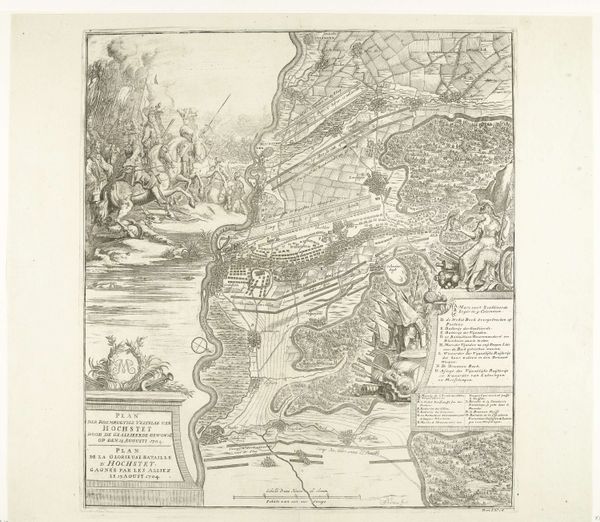
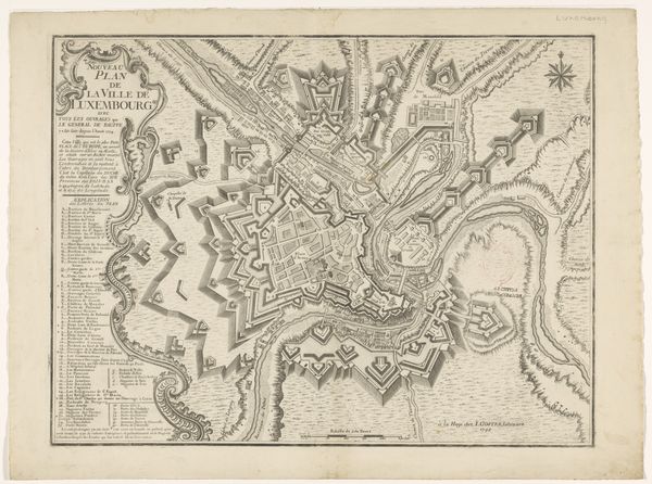
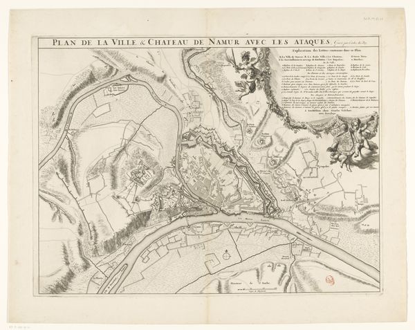
drawing, print, ink, engraving
#
drawing
# print
#
landscape
#
ink
#
history-painting
#
engraving
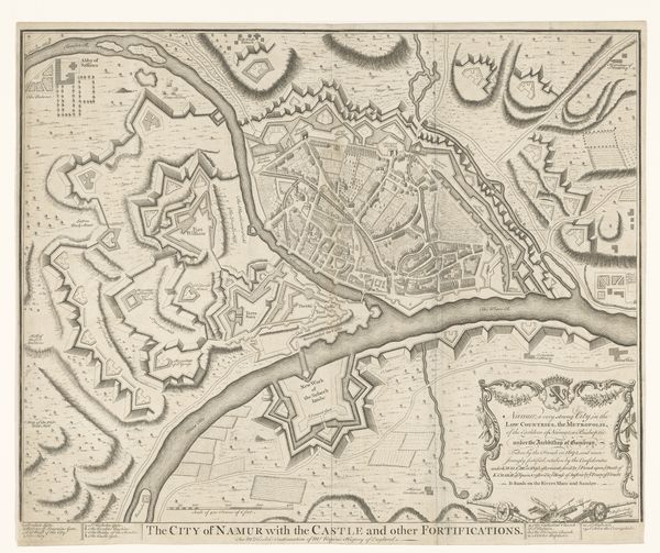
Dimensions: height 387 mm, width 480 mm
Copyright: Rijks Museum: Open Domain
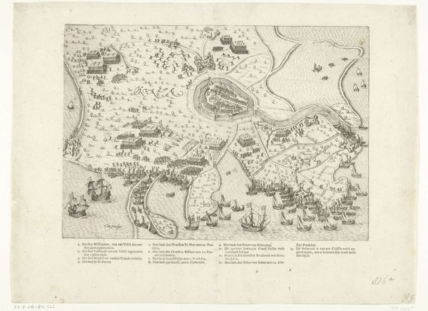
Editor: Here we have "Slag bij Malplaquet, 1709" created in 1709 by Jacobus Harrewijn, using drawing and printmaking techniques with ink and engraving. What strikes me immediately is how detailed and intricate the whole composition appears, but in a very ordered, almost mathematical way. What do you see in this piece? Curator: What captivates me first is the interplay between line and form. Observe the precise articulation of the lines; how they delineate space and suggest depth through variation in weight and density. The engraving operates on a formal level as a constructed reality. Consider how the artist utilized the constraints of the medium to portray a landscape filled with warfare. Do you notice how the varying line weights impact the readability of the image? Editor: I do. The thicker lines definitely draw my eye, making the paths and larger troop formations stand out, almost creating a sense of hierarchy. Are you suggesting that the aesthetic choices of the engraver enhance the legibility of this complex image? Curator: Precisely. Furthermore, consider the use of texture and pattern. Note the distinct mark-making used to depict different elements: forests, fields, troop deployments. How do these choices affect your perception of the overall image? Editor: They definitely bring a sense of variety and break up the potential monotony of a map-like image. I’m starting to see that what I perceived as a dry depiction of war actually involves sophisticated techniques to draw in the viewer. Curator: Precisely! By understanding how the composition affects our understanding of a work of art, we unveil new paths for interpretation, new experiences!
Comments
No comments
Be the first to comment and join the conversation on the ultimate creative platform.
More like this