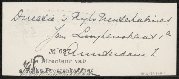
Ontwerp voor een advertentie van Bureau voor Illustratie, Boek- en Sierkunst Mimosa 1884 - 1952
0:00
0:00
drawing, graphic-art, typography, poster
#
drawing
#
graphic-art
#
art-nouveau
#
script typography
#
hand-lettering
#
hand drawn type
#
hand lettering
#
personal sketchbook
#
typography
#
hand-drawn typeface
#
sketchbook drawing
#
storyboard and sketchbook work
#
poster
#
sketchbook art
#
small lettering
Dimensions: height 148 mm, width 229 mm
Copyright: Rijks Museum: Open Domain
This advertisement design was made by Reinier Willem Petrus de Vries, though the exact date is unknown, probably on paper, and is all about the art of illustration, book design and ornamentation. Look at the way he approaches the typography, the confident line of the lettering, how it varies in thickness. You can see he’s really thinking about the relationship between form and function, how the letters themselves can become little illustrations. The layout is simple, but there’s a real dynamism in the arrangement. The word "Reclame!" really jumps out, doesn't it? The exclamation mark is a perfect little flourish, a playful gesture that adds so much energy. Notice also the small circular ornament to the right, a decorative flourish which contrasts with the strong lines of the type. It reminds me a little of the Vienna Secession movement, like the work of Koloman Moser, who was also interested in blurring the lines between fine art and design. Ultimately, it’s about finding the sweet spot between clarity and beauty, and embracing the idea that art can be both practical and expressive.
Comments
No comments
Be the first to comment and join the conversation on the ultimate creative platform.
More like this