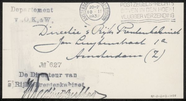
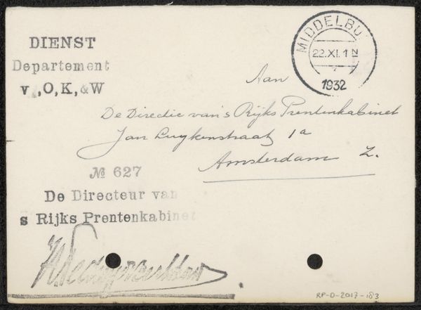
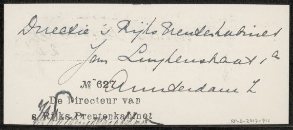
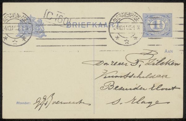
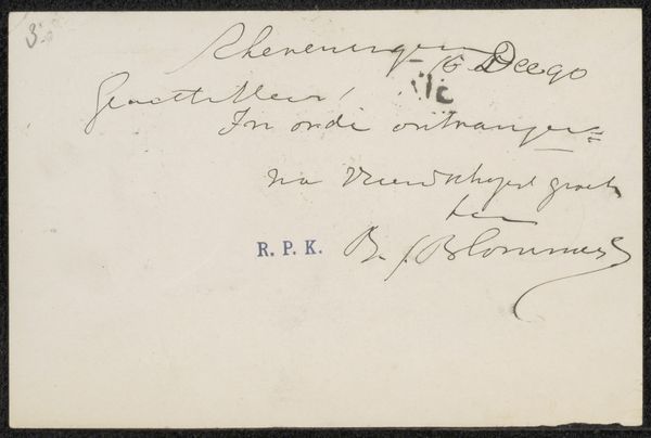
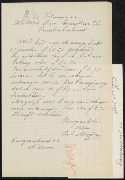
Briefkaart aan jonkheer Hendrik Teding van Berkhout (1879-1969) before 1932
0:00
0:00
dickket
Rijksmuseum
drawing, mixed-media, paper, ink, pen
#
portrait
#
drawing
#
mixed-media
#
script typography
#
hand-lettering
#
hand drawn type
#
hand lettering
#
paper
#
personal sketchbook
#
ink
#
hand-drawn typeface
#
pen-ink sketch
#
pen work
#
sketchbook drawing
#
pen
#
sketchbook art
#
calligraphy
Copyright: Rijks Museum: Open Domain
Curator: I am immediately drawn to the intricate play of line and form; the balance feels both careful and considered. The overall impression is one of subdued formality, don’t you agree? Editor: We are looking at "Briefkaart aan jonkheer Hendrik Teding van Berkhout (1879-1969)," created before 1932, from Dick Ket and held at the Rijksmuseum. It employs a mixed media approach. It speaks volumes about formality, yes, but perhaps also a very particular set of social cues of its time. Notice how the scripted address mimics formal typeface conventions, creating a sort of symbolic dance between personal and public address. Curator: Yes, the tension is fascinating! The rigid, typeset "Departement v,O,K,W," contrasts beautifully with the fluid, calligraphic "Directie’s Rijks Prentenkabinet." And what do you make of the visual hierarchy at play? Editor: Precisely! The calligraphic flourishes lend a personal touch to what might otherwise be a rather impersonal administrative matter. The address becomes an emblem, if you will, subtly reinforcing institutional identity. The way these forms converge suggests the layers of communication inherent in such documents – official pronouncements nestled within the personalized space of the letter form itself. Curator: You’re right, it speaks to layers of history, social standing, and communication traditions embedded in everyday gestures. The ink on paper takes on a presence; it's not just words, but cultural memory materialized. Even the stamp in the upper corner contributes! Editor: Definitely, everything down to the faint irregularities of the paper plays into its identity as a specific message. The overall visual composition – its distribution of dark and light, its deliberate yet restrained character– offers a glimpse into the structured beauty of practical communication. It invites us to reconsider how even the most functional pieces can embody hidden levels of artistry. Curator: It makes me ponder on all those unseen moments in the everyday – the way we use symbols to maintain connections and meaning. Editor: Agreed! Now I see more in this humble briefkaart than initially met my eye!
Comments
No comments
Be the first to comment and join the conversation on the ultimate creative platform.
More like this