drawing, paper, ink
#
drawing
#
script typography
#
hand-lettering
#
hand drawn type
#
hand lettering
#
paper
#
personal sketchbook
#
ink
#
hand-drawn typeface
#
thick font
#
sketchbook drawing
#
handwritten font
#
small lettering
Copyright: Rijks Museum: Open Domain
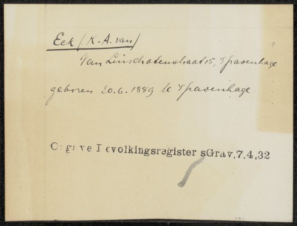
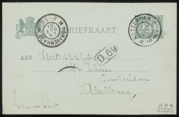
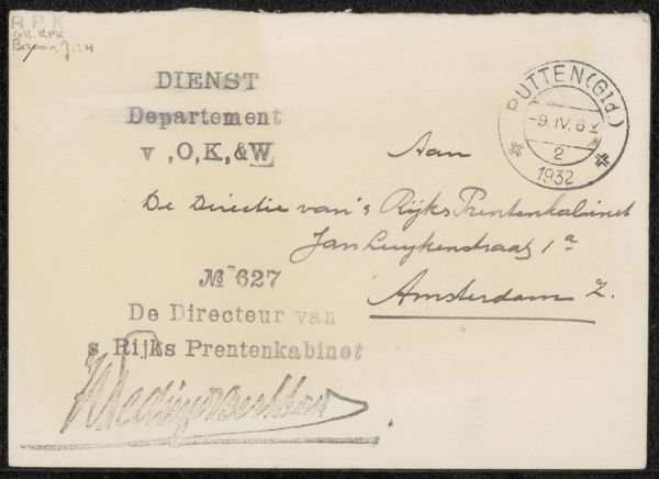
This document concerning C. de Wolff is an anonymous piece, and looking at it I see a different kind of mark-making, one about bureaucratic systems. There's something really beautiful about the simple, almost naive handwriting here. The strokes are so clear and direct, each letter carefully formed. The texture of the paper itself is so present, you can imagine the writer holding the pen, making these marks. The ink isn't thick, but it's bold enough to feel solid and important. It's so interesting to see the contrast between the flowing script and the rigid, typeset part at the bottom. Thinking about the word "Rotterdam" repeated, it's almost like a mantra, a grounding point. I think of the early work of someone like Cy Twombly, with all those repetitions. But in the end, it’s the feeling of something human, something personal, trying to find its way through a system, that really resonates.
Comments
No comments
Be the first to comment and join the conversation on the ultimate creative platform.
More like this