drawing, paper, ink, pen
#
drawing
#
hand-lettering
#
dutch-golden-age
#
hand drawn type
#
hand lettering
#
paper
#
personal sketchbook
#
ink
#
hand-drawn typeface
#
ink drawing experimentation
#
pen-ink sketch
#
pen work
#
sketchbook drawing
#
pen
#
sketchbook art
#
mail-art
Copyright: Rijks Museum: Open Domain
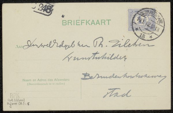
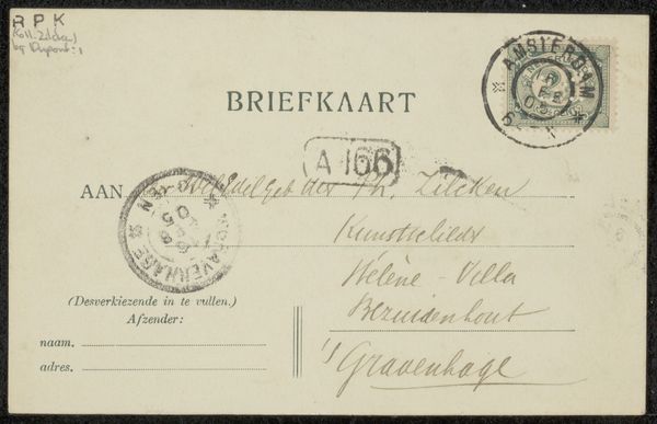
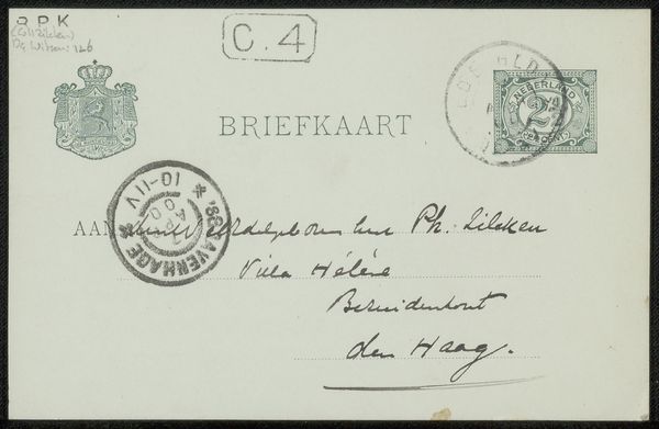
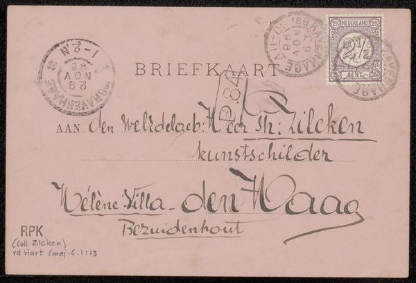
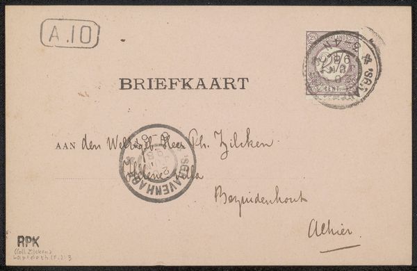
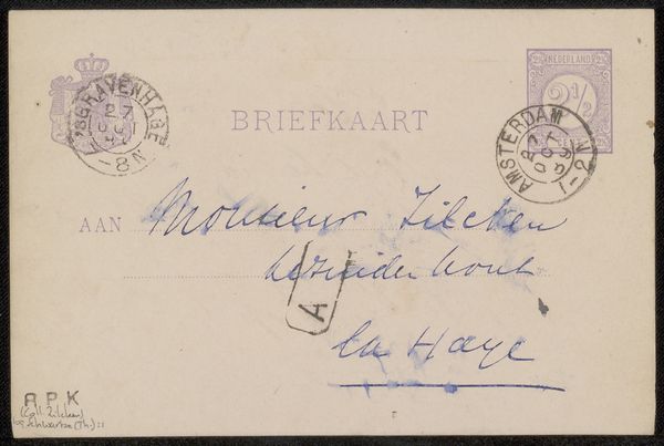
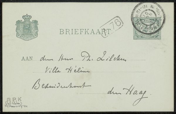
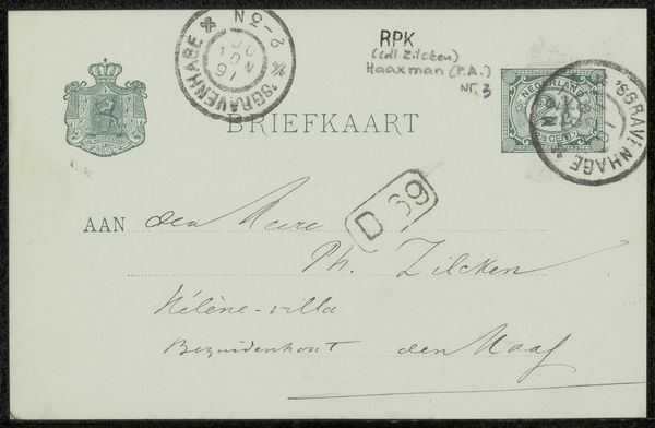
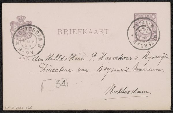
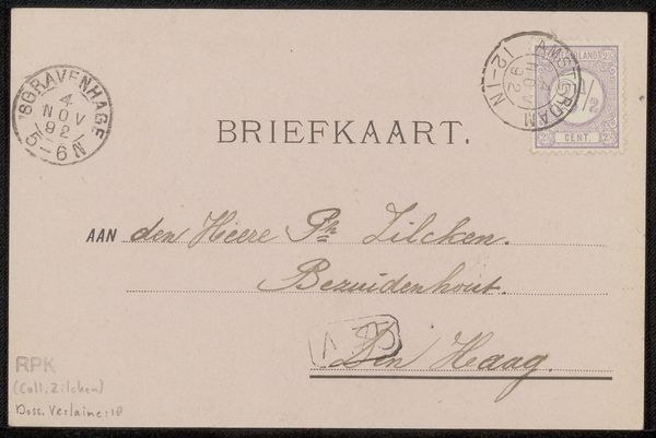
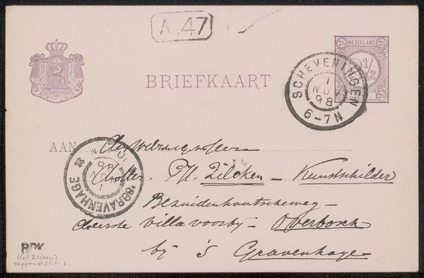
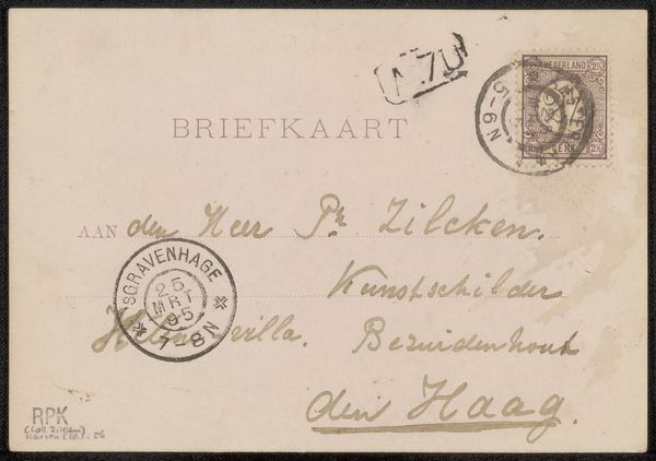
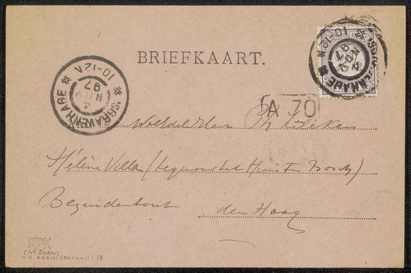
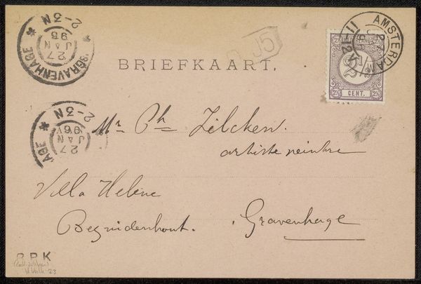
Curator: This unassuming little object, "Briefkaart aan Philip Zilcken," is tentatively dated between 1913 and 1919 and crafted by Barend van den Kieboom, employing ink on paper. Editor: It's interesting how something so utilitarian can evoke such a strong sense of intimacy. The hurried script, the slightly faded ink – it feels almost like eavesdropping on a conversation between two souls across time. Curator: Exactly! It’s so direct. What catches your eye, iconographically speaking? Editor: Well, there's something intriguing in the choice of script, the hand-lettering itself. It reminds us that even everyday communication can carry artistic intent. It’s as if van den Kieboom saw the postcard as a mini-canvas, a space for artistic expression. This feels very much aligned with 'mail art', which in itself holds subversive artistic expression. And those cancellations, the stamps… each adds layers of history, a tangible connection to a specific moment. It reminds us that even ephemera carries weight, historical and emotional. Curator: It’s funny you say 'mini-canvas.' I can almost imagine Kieboom seeing the constraints of the format as a challenge – to compress intention, information, perhaps even emotion, into this small space. A single expressive brushstroke, where instead he has calligraphic choices. Do you find yourself wondering what their connection was? The note is quite terse, almost perfunctory, no greeting. It feels more businesslike, which is oddly intriguing. What could have prompted this postcard? Editor: The fact that the brief text has an artistic context adds weight. Even the printed "BRIEFKAART" at the top gets repurposed in the conversation, visually. And the rubber stamps… they stand in as a reminder of power structures and their attempts to organize and process information... Curator: A subtle rebellion, perhaps? A reclamation of space and purpose? Editor: Indeed, maybe using the traditional form to express individuality within societal constraints. Curator: So much communicated in such a small piece, right? Editor: Absolutely! It becomes a testament to how deeply we are enmeshed within the cultural symbols we create – and inherit. A tangible connection.
Comments
No comments
Be the first to comment and join the conversation on the ultimate creative platform.
