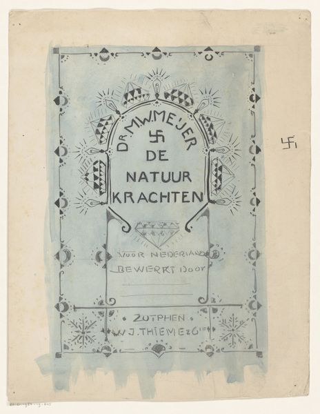
Omslag van: Dr. M.W. Meijer, De natuurkrachten, aflevering 1, 1904 1904
0:00
0:00
graphic-art, print, typography, poster
#
graphic-art
#
art-nouveau
# print
#
landscape
#
typography
#
decorative-art
#
poster
Dimensions: height 266 mm, width 185 mm
Copyright: Rijks Museum: Open Domain
Curator: Looking at this striking book cover from 1904, titled "Omslag van: Dr. M.W. Meijer, De natuurkrachten, aflevering 1," we can see Reinier Willem Petrus de Vries’ take on Art Nouveau design. This piece is a print poster advertising a booklet, as you can see with the typography. Editor: My first impression is that it feels very…intentional. The colour palette is restrained, but those geometric, crystalline shapes really pop against the pale background. Almost jewel-like, radiating some unknown power. Curator: Those "jewels," as you called them, evoke the popular Art Nouveau themes of the era, celebrating science. Consider how those stylized crystalline forms also visually align with the concept of “nature’s forces,” which the cover heralds. Editor: It is interesting how it frames nature not as organic but crystalline, a rigid geometry of the natural world, almost imposing structure. Considering this cover was printed during the rise of scientific positivism, it possibly represents this new relationship that the Dutch had with the natural environment? A need to see the world rationally? Curator: Precisely. The cover isn’t just decorative; it acts as a visual invitation into the world of natural sciences framed by reason, promoted by men like Dr. Meijer and Goudsmit, whose names hold specific cultural weight in scientific circles. It’s carefully designed to lend credibility to its scientific contents. Editor: Thinking about the cover’s reception, it could also tap into a broader societal aspiration towards order, and progress through science. With the rapid industrial changes at the time, how did it influence popular perception? Did its imagery create an accessible window into complicated science, allowing nature to be owned? Curator: Definitely food for thought. It's interesting how such an image can resonate with both an embrace of scientific rationalism, whilst appealing aesthetically, to engage and, hopefully, sell. The symbolism, the context, and even the design whisper stories about a time when science sought beauty in its outreach to the public. Editor: And perhaps reminds us how design is always entwined with social and political intentions, consciously or not, forming, shaping our collective memory.
Comments
No comments
Be the first to comment and join the conversation on the ultimate creative platform.
More like this