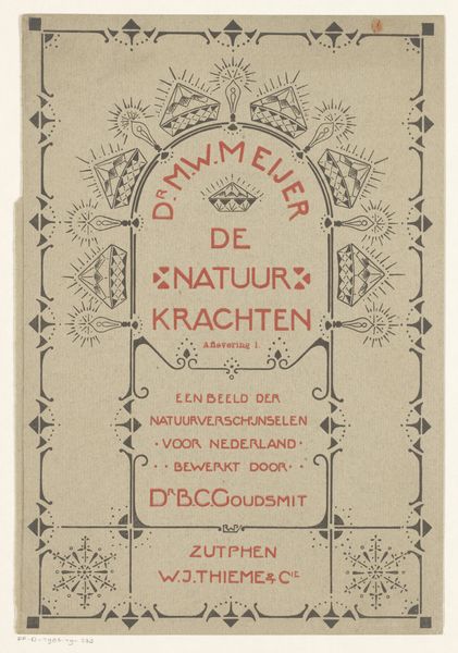
Bandontwerp voor: Dr. M.W. Meijer, De natuurkrachten, 1904 1904
0:00
0:00
drawing, graphic-art, paper, watercolor, typography
#
drawing
#
graphic-art
#
art-nouveau
#
paper
#
watercolor
#
typography
#
decorative-art
#
watercolor
Dimensions: height 324 mm, width 253 mm
Copyright: Rijks Museum: Open Domain
Curator: Let’s explore this intriguing design, "Bandontwerp voor: Dr. M.W. Meijer, De natuurkrachten," a book cover design by Reinier Willem Petrus de Vries from 1904. It combines drawing, watercolor, typography, and graphic elements. Editor: It's a little unsettling, honestly. The light blue wash feels almost sickly, and the crisp Art Nouveau geometric patterns feel at odds with that fragility. There's something unsettling about how formal and constrained it seems, like it's trying to repress something. Curator: The choice of geometric forms and stylized typography is key. Art Nouveau, at its heart, tried to impose order and meaning, almost as a symbol to counter early-industrial chaos, so restraint and natural elements were highly celebrated in book-binding. Notice the geometric representations of flora and radiating light bursts - alluding to those 'forces of nature'. Editor: Interesting take. Considering its turn-of-the-century context, with rising nationalism, does "forces of nature" have darker, quasi-scientific, almost eugenic undertones that the decorative presentation is trying to distract us from? Curator: It's certainly plausible, given the intellectual and political climate. There’s also something captivating in the interplay between the flowing Art Nouveau elements and those rigid geometric forms. Perhaps it's the artist attempting to reconcile human intervention and understanding within the boundless, complex realm of the natural world? Editor: Or control. The use of those rigid frames contains nature in something like an ornate cage. Are we meant to see a celebration of discovery or an urge to tame the world? The design leaves the book unnamed so who is this Dr. M. W. Meijer to command such "powers"? Curator: I concede it is multi-faceted. Perhaps the success of the design resides in this very ambiguity, prompting a continuous examination of science and human aspiration in relationship with nature. Editor: It leaves one reflecting upon the blurred lines between aesthetics, science, and the insidious ideologies of that period, and how that combination leaves lingering disquiet.
Comments
No comments
Be the first to comment and join the conversation on the ultimate creative platform.
More like this