drawing, ink, pen
portrait
drawing
script typography
hand-lettering
baroque
lettering
hand drawn type
hand lettering
ink
hand-drawn typeface
fading type
calligraphic
typography style
pen
calligraphy
small lettering
Dimensions: height 197 mm, width 299 mm
Copyright: Rijks Museum: Open Domain
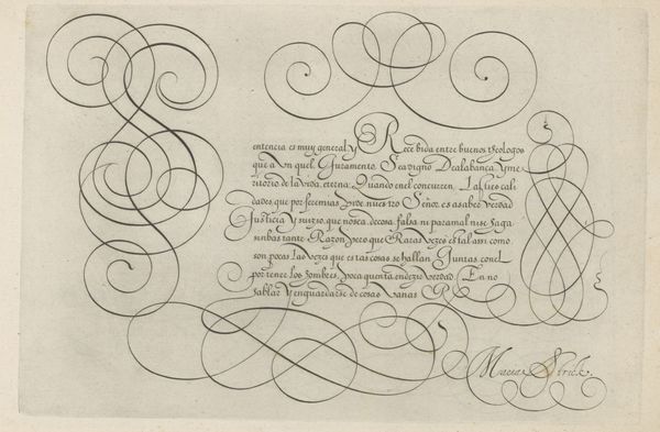
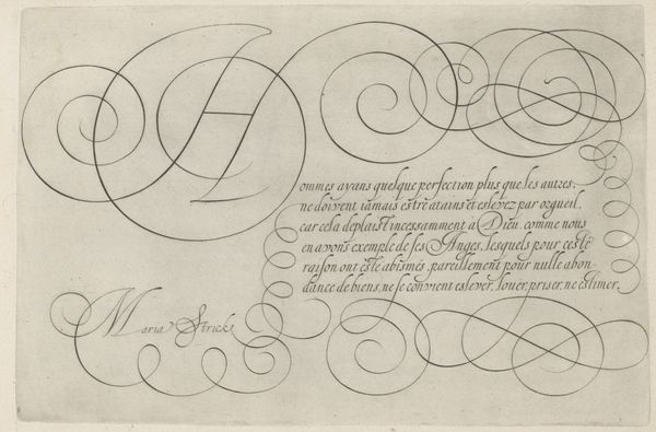
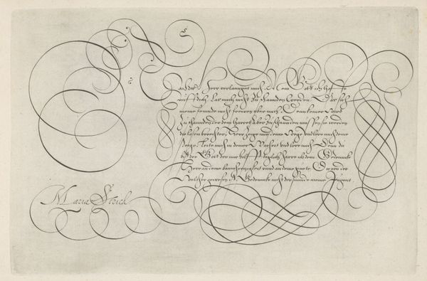
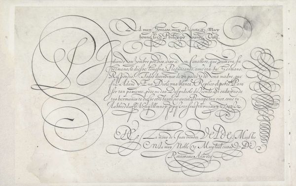
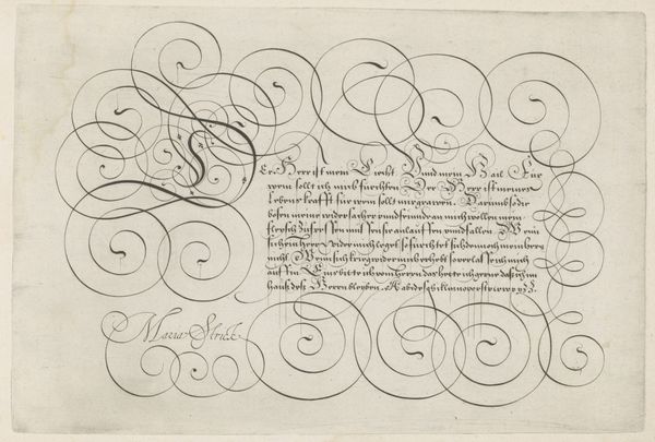
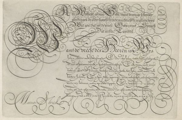
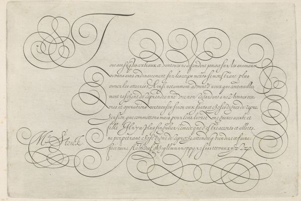
Curator: I find this drawing particularly striking. This work, titled “Schrijfvoorbeeld met kapitaal U,” was created in 1618 by Hans Strick. It's an example of calligraphy rendered with ink on paper, housed here at the Rijksmuseum. What's your first impression? Editor: Visually, I am captivated by the incredible line work and the density of text. The image's monochromatic simplicity is deceptive, because there is movement throughout—but I have trouble making out distinct words and letterforms. It is the Baroque era's flair embodied. I can't help thinking about literacy at this time... who was meant to decode this, and how did such skills shape power dynamics? Curator: Indeed, literacy during the Baroque period was tied to social status and governance. Calligraphy, especially, was considered a high art form, integral to legal documents, official decrees, and, importantly, personal correspondence. These weren’t merely functional scripts, they were performative declarations of identity and class. Strick's drawing provides an exemplar of the techniques used in formal settings. Editor: Absolutely. Consider, too, that typography, handwriting and calligraphy are methods of inscription loaded with gender and cultural politics. By drawing attention to the stylistic artistry inherent to letterforms, the image spotlights its own process of meaning-making—asking us, even forcing us—to confront legibility and what it means to understand written language in distinct ways. I wonder how accessible these sorts of drawn or calligraphic scripts were. Curator: Well, access would have been largely limited to the educated elite, mostly men in positions of power. Though women of the upper class were also instructed in ornamental scripts for personal correspondence and managing household affairs, professional scribes were overwhelmingly male. Think of the courts, the religious institutions and, of course, printing houses—each maintaining their distinct calligraphic traditions as acts of distinction. This is visible when you think about guilds and who can join such organizations. Editor: Yes. And to think that such careful letterform represents its own form of gatekeeping. The pen becomes an extension of both power and resistance depending on whose hand wields it, dictating who has a voice in historical narratives and shaping how that voice is recognized and received. Hans Strick certainly demonstrates authority with a flourished, elaborate "S." Curator: I see Strick's letterforms as both reflecting the socio-political structures and serving as beautiful aesthetic objects meant to project those hierarchies through careful line. Editor: Looking at the image, I can see and think through several different cultural histories at once, and each resonates powerfully.
Comments
No comments
Be the first to comment and join the conversation on the ultimate creative platform.
More like this