drawing, paper, typography, ink
#
drawing
#
script typography
#
hand-lettering
#
baroque
#
dutch-golden-age
#
lettering
#
hand drawn type
#
hand lettering
#
paper
#
word art
#
typography
#
ink
#
hand-drawn typeface
#
fading type
#
typography style
#
calligraphy
#
small lettering
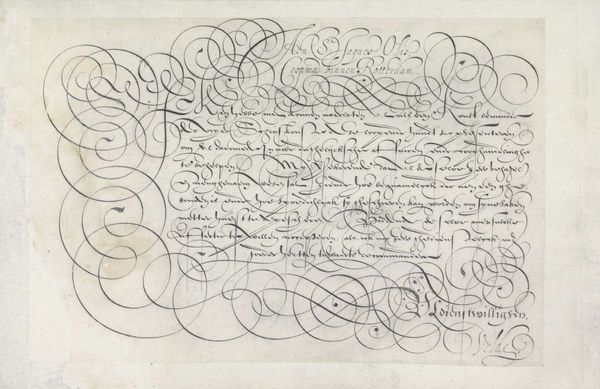
Dimensions: height 202 mm, width 309 mm
Copyright: Rijks Museum: Open Domain
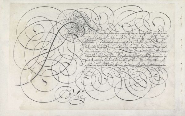
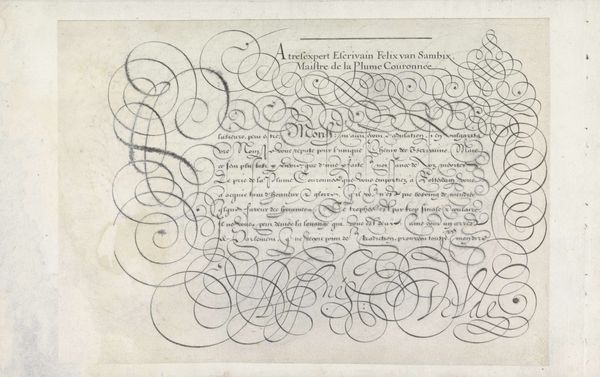
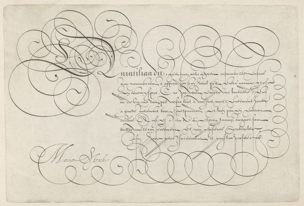
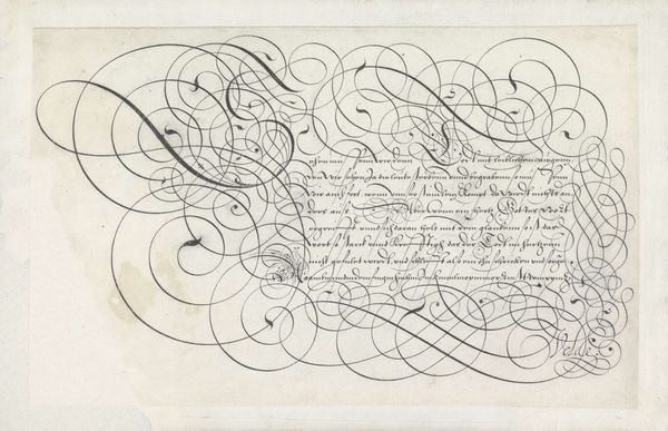
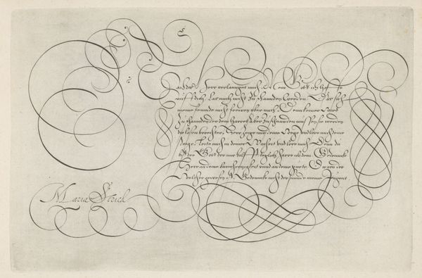
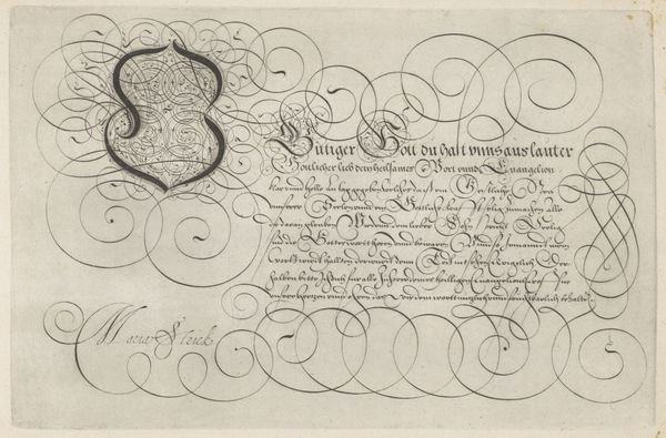
Jan van de Velde I created this calligraphic design, "Ontwerp van een schrijfvoorbeeld: Al muy honrado" in the Netherlands, sometime before his death in 1623, using pen and ink. This writing sample, now preserved in the Rijksmuseum, speaks volumes about the values and skills esteemed in Dutch society at the time. Calligraphy wasn't just about neat handwriting, it was an art form, a display of education, refinement, and professional competence. The flourishes, the controlled variation in line thickness, all signaled the writer’s mastery. The text itself, though partially obscured by the elaborate script, hints at dialogues and perhaps moral lessons. To fully understand this piece, we would want to delve into the manuals and educational practices of the time. Who was being taught to write like this, and for what purposes? Was this a skill primarily for merchants, or also for aspiring members of the government? By looking beyond the visual elegance and examining the social and institutional context, we can begin to understand the values embedded in this seemingly simple writing sample.
Comments
No comments
Be the first to comment and join the conversation on the ultimate creative platform.
More like this