drawing, paper, ink
#
drawing
#
baroque
#
paper
#
ink
#
calligraphy
Dimensions: height 196 mm, width 298 mm
Copyright: Rijks Museum: Open Domain
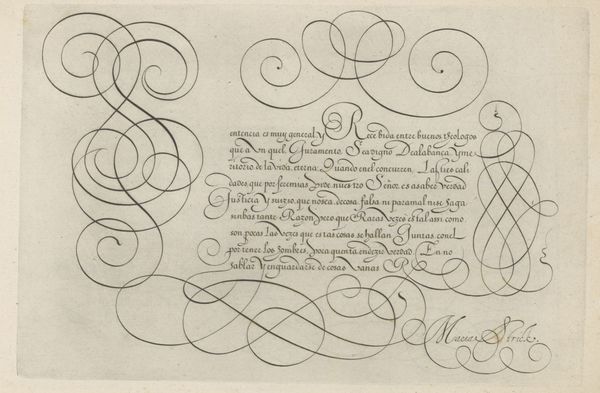
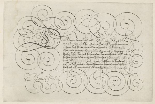
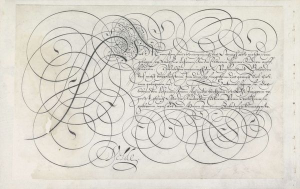
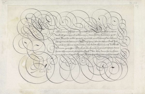
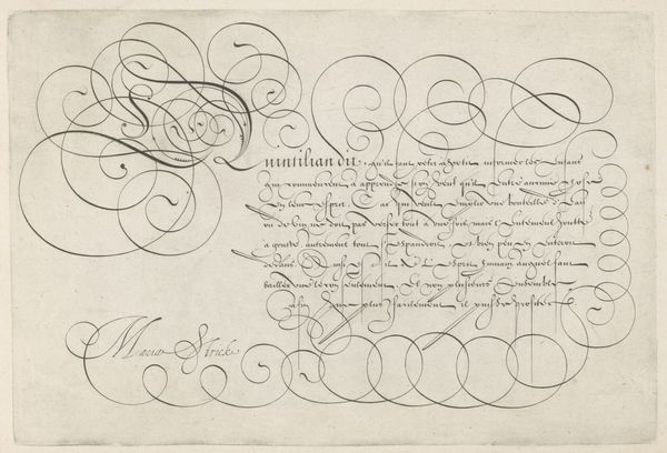
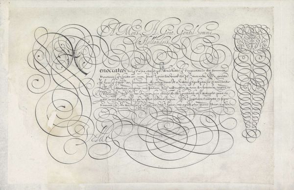
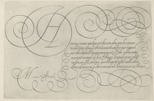
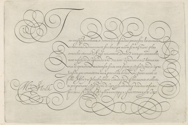
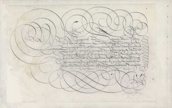
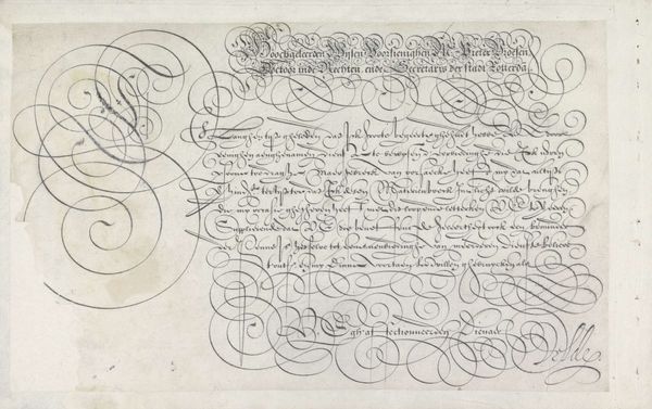
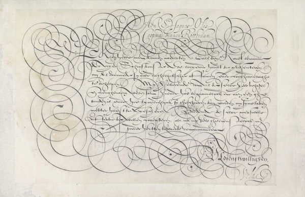
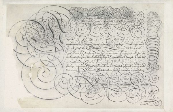
This calligraphic sheet, made by Hans Strick, showcases a mastery of penmanship. Look closely, and you’ll see how the thin lines give way to thick swells with absolute control. Strick, active in the late 16th century, would have trained for years to develop this skill, using quill pens and iron gall ink—a standard writing medium at the time. The ink itself is subtly brown, and catches the light with a gentle sheen. The letterforms are embellished with flourishes and looping lines that serve as a kind of visual counterpoint to the text itself. Writing manuals like this served as models for aspiring scribes. These weren’t just artists, but professionals employed in the administration of government, commerce, and the law. Calligraphy was more than just a pretty script. It was the means by which social order was maintained. So next time you see beautiful penmanship, remember that it represents the convergence of aesthetics, labor, and power.
Comments
No comments
Be the first to comment and join the conversation on the ultimate creative platform.
More like this