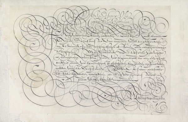
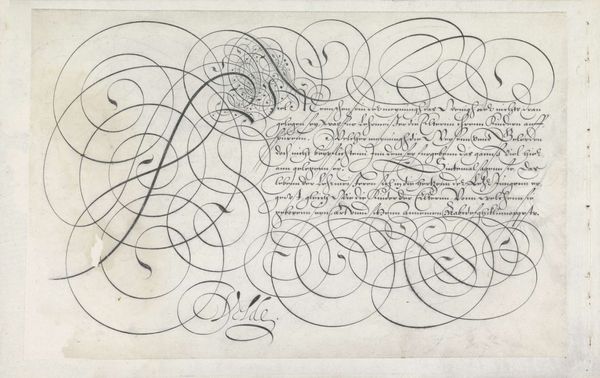
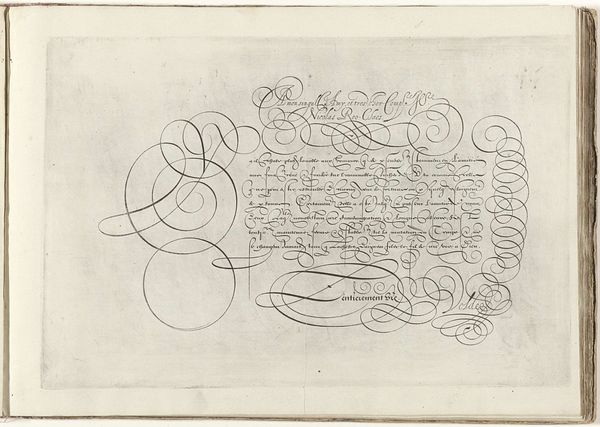
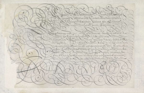
Ontwerp van een schrijfvoorbeeld: Hoochgeleerden Wijsen (...). 1605
0:00
0:00
janvandeveldei
Rijksmuseum
drawing, graphic-art, textile, paper, ink, pen
#
drawing
#
graphic-art
#
hand-lettering
#
dutch-golden-age
#
hand drawn type
#
hand lettering
#
textile
#
paper
#
ink
#
hand-drawn typeface
#
hand drawn
#
calligraphic
#
pen work
#
sketchbook drawing
#
pen
#
sketchbook art
#
calligraphy
#
small lettering
Dimensions: height 193 mm, width 312 mm
Copyright: Rijks Museum: Open Domain
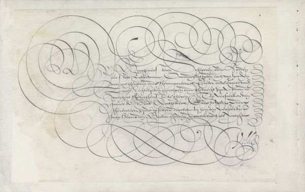
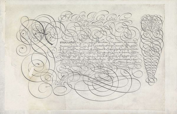
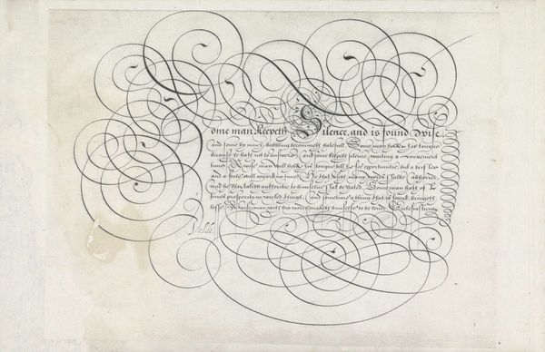
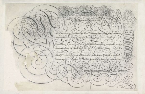
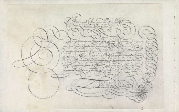
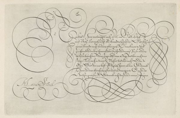
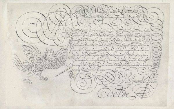
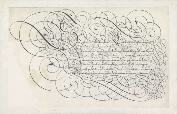
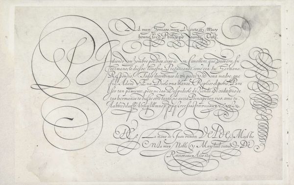
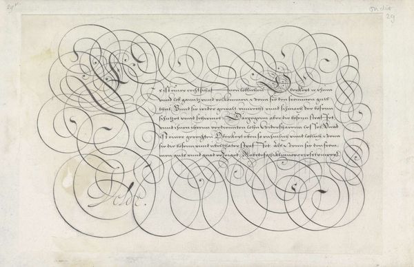
Jan van de Velde I made this calligraphic writing sample, sometime before his death in 1623, using pen and ink on paper. Look closely, and you’ll see that the letterforms practically dissolve into abstraction. The writing is so florid that its legibility is secondary to the pure pleasure of line. The material of ink allows for a remarkable range of expression, from controlled precision to wild improvisation. Consider how the ink pools and feathers on the page, giving texture and depth to the composition. Van de Velde must have been an absolute virtuoso with the quill to achieve such fluidity. Back then, calligraphy was more than just beautiful writing. It was a demonstration of skill, a key professional attribute. In a world increasingly reliant on the written word for commerce and governance, experts in penmanship were highly valued. This work, therefore, isn't merely decorative. It speaks to the social importance of craft, and the labor involved in mastering it.
Comments
No comments
Be the first to comment and join the conversation on the ultimate creative platform.
More like this