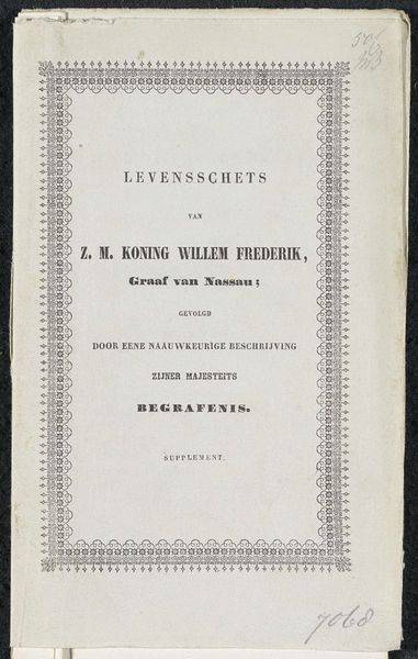
Het Acht-en-twintigste verslag van de Zuid-Afrikaansche Bijbelvereeniging 1856
0:00
0:00
#
type repetition
#
aged paper
#
script typography
#
hand drawn type
#
hand-drawn typeface
#
fading type
#
stylized text
#
thick font
#
golden font
#
historical font
Dimensions: height 21.4 cm, width 13.6 cm
Copyright: Rijks Museum: Open Domain
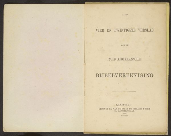
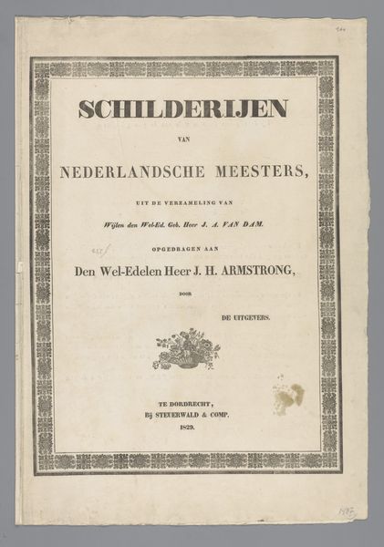
Editor: Here we have “Het Acht-en-twintigste verslag van de Zuid-Afrikaansche Bijbelvereeniging,” printed in 1856 by van de Sant de Villiers & Co. It's a beautiful example of aged typography, almost sepia-toned, and that border design is so intricate. What do you see in this piece, beyond just the historical document? Curator: Let us look at the structure itself. The vertical alignment of the text, moving from the general, "HET," to the specific, the full title. Note the implied hierarchy through font size and weight. Do you observe how the title is framed by a delicate, almost lace-like border? This juxtaposition is where meaning arises. Editor: Yes, it’s a contrast between the bold text and the ornate, lighter frame. The frame looks machine made, and I suppose the typography is also? Curator: Indeed, but consider the intentionality. The frame is a repetitive, almost mechanical pattern which contains the varied typefaces within, hinting at a synthesis between industrial production and crafted individuality. Does this tension inform our understanding of the report's content and function? Editor: I hadn't thought of it that way! So the interplay between the mechanized frame and the somewhat hand-drawn looking typography suggests a broader tension... Thank you, this has been illuminating. Curator: And for myself. The composition of textual elements is rarely simple documentation, and always rich when one pays careful attention to form.
Comments
No comments
Be the first to comment and join the conversation on the ultimate creative platform.
