graphic-art, print, paper, typography
#
graphic-art
#
aged paper
#
script typography
#
hand-lettering
# print
#
hand drawn type
#
hand lettering
#
paper
#
personal sketchbook
#
typography
#
hand-drawn typeface
#
fading type
#
thick font
#
handwritten font
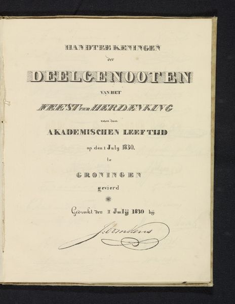
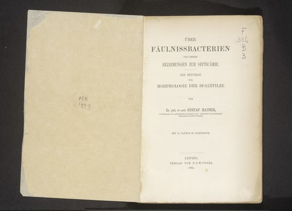
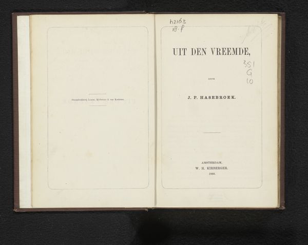
Dimensions: height 263 mm, width 208 mm
Copyright: Rijks Museum: Open Domain
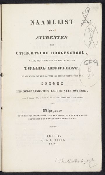
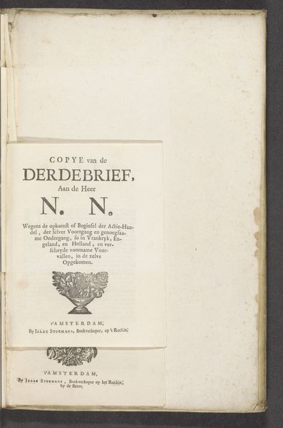
Editor: This is "Eerste titelblad, 1830," an early 19th-century print on paper. It almost looks like a page ripped straight from a book. I'm drawn to the handmade quality of the typography and wonder about its purpose. What stands out to you? Curator: I'm intrigued by its materiality and how it embodies a specific moment of production. The paper itself – its texture, its likely handmade nature – speaks volumes. The printing process, too. Consider the labor involved in creating the typeface, possibly bespoke, then the act of setting the type and pulling the print. Editor: So, you see the process of its creation as central to understanding its meaning? Curator: Absolutely. What was the intended lifespan of this document? Was it meant for ephemeral use or archival preservation? Look at the ink, its consistency and application, pointing towards the available technologies and the skill of the printer. Think about who consumed this, their literacy, and their access to printed material. Each choice, each material, reinforces social status and class dynamics. Editor: The listing of "Akademischen leeftijd", a reminder that this was produced in Groningen and by academics - probably by students celebrating a jubilee. Curator: Exactly. We have to remember too, printing wasn't only functional: was there an aesthetic value attributed to typography as manual labour at this time? Or how did emerging mechanized printing practices influence, even threaten, traditional artisanal book-making, especially around the technologies around reproducibility? The work operates in a complex economic system and highlights broader consumption patterns of knowledge. Editor: So by examining its physical aspects, its materials and means of creation, it almost functions as a cultural artifact? Curator: Precisely. It’s about extracting meaning from the nuts and bolts, rather than getting lost in symbolism. Editor: That gives me a lot to think about. I appreciate the emphasis on its creation and material being crucial to its message.
Comments
No comments
Be the first to comment and join the conversation on the ultimate creative platform.
More like this