graphic-art, print, typography
#
portrait
#
script typeface
#
graphic-art
#
aged paper
#
script typography
#
hand-lettering
# print
#
hand drawn type
#
personal sketchbook
#
typography
#
hand-written
#
hand-drawn typeface
#
thick font
#
handwritten font
#
academic-art
Dimensions: height 263 mm, width 208 mm
Copyright: Rijks Museum: Open Domain
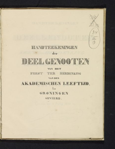
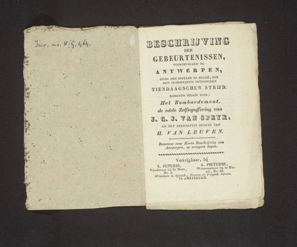
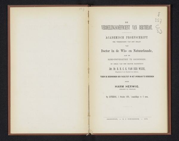
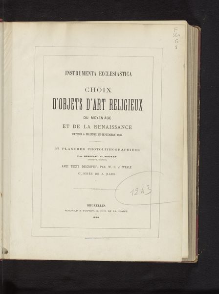
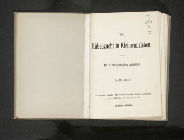
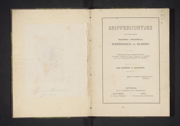
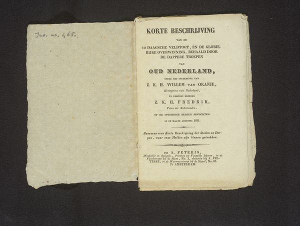
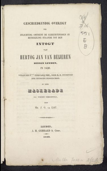
This title page, printed in 1830, commemorates an academic jubilee in Groningen. The central motif, the stylized lettering, speaks volumes about cultural memory. The bold, almost classical font evokes a sense of tradition, reminiscent of ancient Roman inscriptions, yet it is printed on paper, a relatively new medium at the time. This juxtaposition highlights a key tension, the integration of classical ideals into modern society. This bold font is used to elevate and embed the text into a shared consciousness of history and legacy. Consider how such typefaces reappear throughout history, from Renaissance manuscripts to early modern printed books. They serve as visual anchors, connecting each new era to the wisdom and authority of the past. Yet, each adaptation subtly shifts its meaning, reflecting the evolving values and anxieties of each age. The cyclical progression of this symbol and how it has resurfaced, evolved, and taken on new meanings in different historical contexts is a testament to the non-linear nature of cultural memory.
Comments
No comments
Be the first to comment and join the conversation on the ultimate creative platform.
