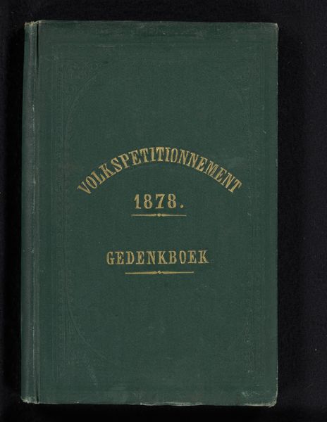
Gedenkboek ter herinnering aan het vijfentwintigjarig bestaan der Rijks Hoogere Burgerschool te Warfum, 1868-1893 1893
0:00
0:00
print, typography
# print
#
book
#
typography
#
academic-art
#
decorative-art
Dimensions: height 250 mm, width 162 mm, thickness 5 mm
Copyright: Rijks Museum: Open Domain
Curator: This is the "Gedenkboek ter herinnering aan het vijfentwintigjarig bestaan der Rijks Hoogere Burgerschool te Warfum, 1868-1893," a commemorative book celebrating the 25th anniversary of a public high school in Warfum. It was published in 1893. Editor: My first impression is the cover’s slightly faded green hue – it evokes a sense of institutional history, something archival and official. The decorative borders lend a formal touch. Curator: The book speaks to a specific cultural moment. The founding of public high schools or "burgerscholen" in the Netherlands in the 19th century reflects a burgeoning emphasis on civic education and the formation of a knowledgeable populace. Editor: The typography contributes to this aura of officialdom; the ornate lettering of "Gedenkboek," contrasted with the simpler, functional text below, suggests a merging of civic pride and practical record-keeping. I wonder what visual motifs are repeated inside. Are there pedagogical symbols? Coats of arms? Curator: Such books often served as important marketing tools for the schools themselves. The imagery, text, and overall presentation would communicate a certain level of prestige, class, and cultural values to prospective students and the broader community. Editor: So the book's value lies beyond the dry record of events, but more about cultivating institutional pride. The ornate “G” resembles gothic illuminated manuscripts; in many ways, that decorative, rather antiquated, lettering connects academic scholarship to a grand lineage, maybe implicitly lending legitimacy to secular scholarship in the Dutch public school system. Curator: Indeed. Also, the deliberate visual choices within the typography can act as subtle indicators of power. By choosing decorative elements that have historical significance, they align themselves within the scope of institutional and societal authority. Editor: Thinking about it further, that blend of function and display probably reinforced the public school's broader role. An instrument of upward social mobility while serving as an emblem of local accomplishment and identity. Curator: It is a potent reminder that seemingly simple commemorative publications often encapsulate complex cultural and political projects. Editor: This careful composition of civic intention and decorative embellishment invites closer inspection into Dutch visual culture.
Comments
No comments
Be the first to comment and join the conversation on the ultimate creative platform.
More like this