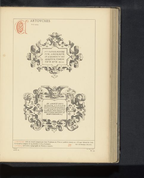
graphic-art, print, textile, paper, typography
#
graphic-art
#
dutch-golden-age
# print
#
textile
#
paper
#
typography
Dimensions: height 195 mm, width 150 mm
Copyright: Rijks Museum: Open Domain
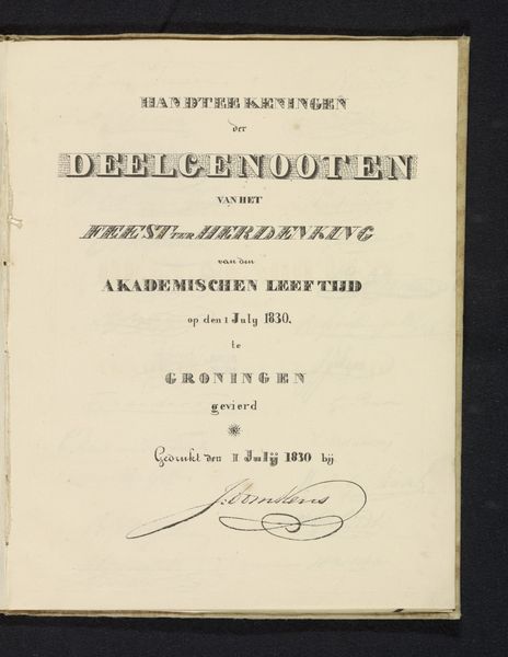
Editor: Here we have "Derde brief over het bedrog van de windhandel, 1720," a print on paper created in 1720 by Isaac Stokmans. The typography gives the work an antiquated, almost official feeling. The content appears critical. How do you interpret this piece, looking at its symbols and imagery? Curator: The “windhandel,” or literally “wind trade,” points to speculative economics – businesses built on air, fleeting and insubstantial. Observe how the central text highlights "de opkomst" (the rise) and "de ondergang" (the downfall). Doesn't that create a cyclical feeling, hinting at inevitable boom and bust? What does the ornament representing a vase teeming with vegetal motifs evoke for you? Editor: I hadn't considered that cyclical reading before. The vase perhaps symbolizes abundance or fertility, even prosperity that maybe isn't so "fertile" after all? I do notice the repeated mention of Amsterdam. Curator: Exactly! This visual symbol and typographic element work together. Amsterdam in this period was the centre of global finance. Consider this Stokmans print as a critique, a cautionary tale told through easily disseminated images and text. A tool of public education, would you agree? Editor: That's a compelling thought, I didn’t really appreciate how such accessible art like prints, even if typographic, can capture political or social sentiments so effectively. Curator: Indeed, prints democratized art, bringing symbolic communication directly to the public. Food for thought on how we visually remember and repeat these cycles, isn't it?
Comments
No comments
Be the first to comment and join the conversation on the ultimate creative platform.
More like this