About this artwork
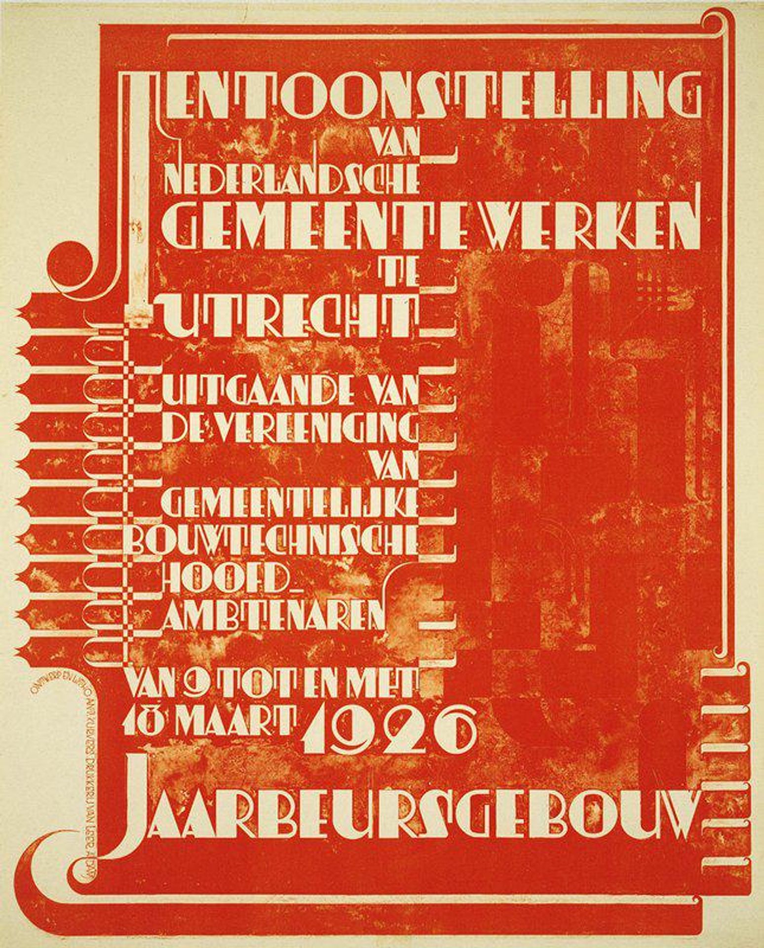
Antoon Kurvers made this poster for an Exhibition of Dutch Municipal Works in 1926. The red ochre feels like it's been printed - or maybe stamped. The way that colour sits on the page speaks to how the image was made - there’s a tactile quality, a sense of pressure and process that feels very physical. The materiality of the poster, that heavy colour, really shapes our experience. Look at the way the red hovers and fades in certain areas. It gives the work a strange depth, like we’re peering through a screen into the past. The simple palette forces your eye around the design. I love how the Art Deco design, especially the text along the left side, takes on a graphic quality with the red, and it reminds me of some of the work of Josef Albers. It feels like an exercise in shape and space and how those shapes make us feel something. The poster has this great ambiguity, where design meets art, and meaning is always on the move.
Tentoonstelling van Nederlandsche Gemeentewerken (Exhibition of Dutch Municipal Works)
1926
Artwork details
- Dimensions
- 38 x 31 in. (96.5 x 78.7 cm) (sheet)40 1/4 x 33 5/8 in. (102.24 x 85.41 cm) (outer frame)
- Location
- Minneapolis Institute of Art
- Copyright
- No Copyright - United States
Comments
Share your thoughts
About this artwork
Antoon Kurvers made this poster for an Exhibition of Dutch Municipal Works in 1926. The red ochre feels like it's been printed - or maybe stamped. The way that colour sits on the page speaks to how the image was made - there’s a tactile quality, a sense of pressure and process that feels very physical. The materiality of the poster, that heavy colour, really shapes our experience. Look at the way the red hovers and fades in certain areas. It gives the work a strange depth, like we’re peering through a screen into the past. The simple palette forces your eye around the design. I love how the Art Deco design, especially the text along the left side, takes on a graphic quality with the red, and it reminds me of some of the work of Josef Albers. It feels like an exercise in shape and space and how those shapes make us feel something. The poster has this great ambiguity, where design meets art, and meaning is always on the move.
Comments
Share your thoughts