drawing, graphic-art, print, paper, typography
#
script typeface
#
drawing
#
graphic-art
#
script typography
#
hand-lettering
#
neoclassicism
#
branded good
# print
#
old engraving style
#
hand drawn type
#
hand lettering
#
paper
#
typography
#
handwritten font
#
golden font
#
word imagery
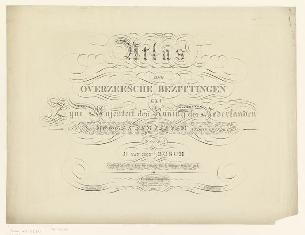
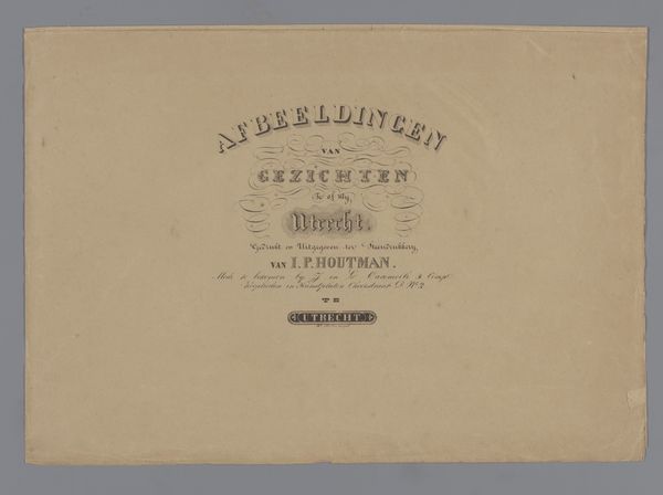
Dimensions: height 230 mm, width 143 mm
Copyright: Rijks Museum: Open Domain
Curator: Alright, let's delve into this title page from 1825, created by Daniël (I) Veelwaard. The artwork is housed here at the Rijksmuseum, it’s called “Titelpagina voor: Jakob Glatz, Julius van Klarenau." It's a drawing, a piece of graphic art really. What jumps out at you? Editor: The lettering is almost hypnotic. It's so precisely rendered. I imagine the hours someone poured over each curve. It feels very… orderly. Curator: The style here clearly echoes Neoclassicism. Veelwaard very consciously evokes that restrained and intellectual aesthetic popular at the time, especially in book design and printmaking. This piece would have functioned much like branding does today. It announces the publication. Editor: And sets a very formal, almost reverent, tone, doesn't it? "Julius van Klarenau," it announces so grandly! I love how the script dances and weaves its way through the composition. Do you think the emphasis on lettering was purely aesthetic? Curator: Certainly not! Consider the social and cultural role of printed matter in the 19th century. Typography wasn't just decorative; it signaled prestige, education, and social standing. Different fonts and styles communicated volumes about the text and its intended audience. This kind of refined lettering connects it to academic authority and the book's presumed value. Editor: So, it's about legitimacy then. I suppose in a world saturated with online noise, we crave that kind of visual signifier still. The craft of it also gets lost these days in a digital world. I would argue the value today is placed on authentic brush script not Neoclassical. Still the message reads the same: credible! Curator: Precisely. By employing a precise engraving style with a strong pedigree, the design lends credibility and a sense of established tradition to the book itself. It also reminds us how the role of craft and aesthetics are tied to status, and to marketing strategies then and now. Editor: Mmm, absolutely. I am still thinking about the amount of care and hours creating the linework for those gorgeous fonts. It almost feels as if one can enter another place, simply by staring into the marks on paper. It shows, not just in art but everyday objects like this. Alright then! Another peek into the past that feels surprisingly familiar! Curator: Indeed. Veelwaard's title page speaks volumes about the cultural values embedded in print and design from centuries past.
Comments
No comments
Be the first to comment and join the conversation on the ultimate creative platform.
More like this