drawing, print, etching, paper, typography
#
portrait
#
drawing
#
hand-lettering
# print
#
etching
#
hand drawn type
#
hand lettering
#
paper
#
personal sketchbook
#
typography
#
hand-drawn typeface
#
fading type
#
sketchbook drawing
#
handwritten font
#
sketchbook art
#
small lettering
Dimensions: height 270 mm, width 375 mm, height 270 mm, width 750 mm
Copyright: Rijks Museum: Open Domain
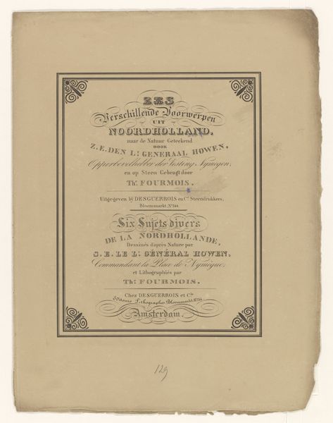
Curator: This intriguing cover is entitled "Omslag voor: Egyptische-Gezigten vierde zestal," created around 1830 by Leendert de Koningh. It combines etching and typography on paper, and is now held in the Rijksmuseum collection. What’s your initial take? Editor: It reminds me of an old apothecary label. All that gorgeous lettering... It's whispering secrets, doesn’t it? There's something really fragile about it, too – almost like you could blow on it and it would fade away. Curator: Fragility is apt, given the context. "Egyptische-Gezichten" translates to "Egyptian Views." The rage for Egyptiana in the early 19th century was fueled by Napoleon's campaigns, leading to the appropriation and, some might say, a weakening of the power of ancient Egyptian symbols through widespread commercial usage. Editor: Exactly! So, De Koningh’s choice of a somewhat fading typeface hints at that superficial engagement, the exotic turned mundane? And it’s kind of funny imagining these "views" packaged like some medicinal concoction. Curator: Precisely. Consider that the "gezichten," the views themselves, were often filtered through a Western lens. The original drawings, credited to den Luit. Gen. De Howen, were then processed through de Koningh's printmaking, creating layers of interpretation and control. Editor: That's fascinating. It feels like de Koningh is playing with our expectations, packaging the exotic... while also suggesting it’s already been processed and repackaged before we even see it. Curator: A self-aware commentary, perhaps, on the mass production and consumption of "otherness." It underscores the political dimensions of visual culture, revealing how even seemingly benign images participate in broader systems of power and knowledge. Editor: This unassuming label packs quite a punch! I'm struck by how it prompts reflection on appropriation and the way the past is filtered. Curator: Indeed. It is a beautiful example of the hidden complexities within seemingly straightforward historical ephemera. A reminder that everything carries its story and ideological baggage.
Comments
No comments
Be the first to comment and join the conversation on the ultimate creative platform.
More like this