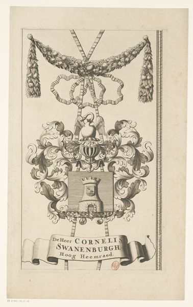
drawing, graphic-art, print, paper, ink, engraving
#
drawing
#
graphic-art
#
neoclacissism
# print
#
paper
#
ink
#
history-painting
#
engraving
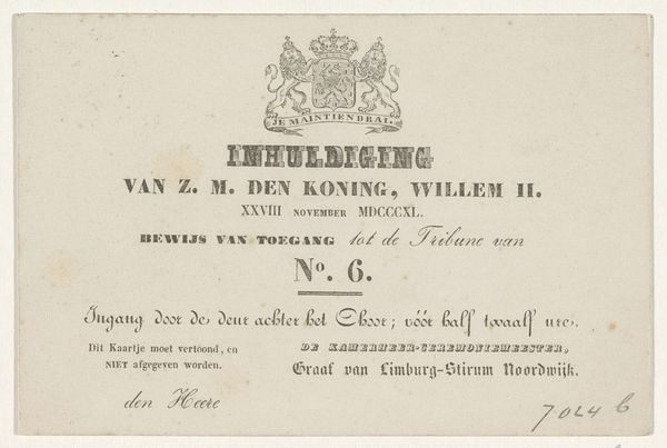
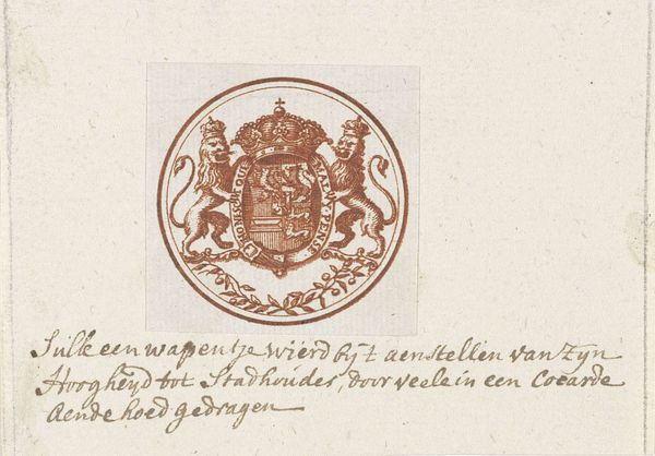
Dimensions: height 93 mm, width 47 mm
Copyright: Rijks Museum: Open Domain
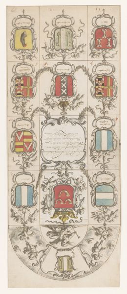
Editor: This is "Vignet met wapen van Nederland" by Anthonie van den Bos, made sometime between 1778 and 1838. It’s a drawing and engraving, mainly in ink on paper. The composition is very formal and seems to focus primarily on communicating the content, what do you make of this piece? Curator: Indeed. Notice the tripartite division, the heraldic achievement above, then the text and its framing lines below, and finally, the stark base. Observe how the engraver’s precise lines delineate the crown, shield, and supporters in the heraldic display. Note also how those rigid components sit within an almost casual oval of tiny pricks and dashes, a juxtaposition, if you will, of geometric form against free form. Editor: That's interesting. The "pricks and dashes" are certainly more informal than the symbols depicted above, which feel decidedly rigid and formal. So what would you say is the significance of this contrast, or the role that such symbolism and balance might have played at the time? Curator: Precisely. Let us consider the symbolism inherent in the arms of state of the Netherlands, rendered in painstaking detail and consider its interplay with the simple typography in service of Royal decree, that of ‘BREVET...KONING der NEDERLANDEN.’ Editor: So it’s a study in contrasts then, of formal iconography versus simple text, perhaps symbolizing different kinds of power at work? Curator: Yes, consider that a valuable point. The piece itself seems an emblem of transitions in style. The composition leads the eye sequentially and also in a very balanced manner, that feels complete, would you agree? Editor: Yes, I can see that now, the weight is distributed evenly, it’s quite balanced between heraldry and text. Thanks for illuminating these relationships. Curator: My pleasure, a pleasure indeed to re-consider what formalism can teach us here, today!
Comments
No comments
Be the first to comment and join the conversation on the ultimate creative platform.
More like this