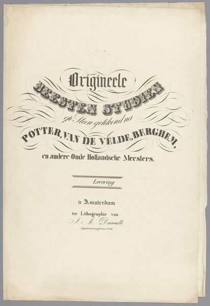
print, typography
# print
#
flower
#
typography
#
fruit
Dimensions: height 474 mm, width 305 mm
Copyright: Rijks Museum: Open Domain
Curator: This is "Omslag met serie bloemen en fruit," or "Cover with a series of flowers and fruit," created in 1836 by A. Weiss. The piece, held at the Rijksmuseum, features typography rendered as a print. What are your initial thoughts? Editor: It feels restrained, almost demure. The limited color palette gives it a sense of faded elegance, like a pressed flower tucked between the pages of a forgotten novel. It's fascinating how typography can evoke such a specific mood. Curator: Absolutely. In the context of the 1830s, printed materials were becoming more widely accessible. Typography was increasingly seen as a vehicle not just for information but also for aesthetic expression. Weiss utilizes a rather elegant style of lettering to portray what seems to be a naturalistic representation of flower and fruit arrangements. Consider what this meant for broader audiences—to bring representations of idealized beauty to a larger portion of society than just painting alone. Editor: So, in essence, this print is a democratizing force? A way to make beauty more accessible across different social classes? What statements, conscious or unconscious, was Weiss trying to communicate by putting together a study that connects flora and fruit so prominently? Are these specific types of flowers and fruits meant to symbolize particular ideas? Curator: I think we can analyze the presentation of “nature,” in the printing press age, as intrinsically intertwined with the rise of a kind of modern gaze toward it—almost like a commercial or aesthetic “discovery” of nature by an urban culture, through images made available to larger and larger segments of the population through modern techniques such as lithography and mass printing. How images themselves come to impact the social and cultural value we place on nature becomes the core here. Editor: So, it becomes a commentary, perhaps unintentionally, on our evolving relationship with the natural world—where we're beginning to experience nature more through mediated images than direct contact? I hadn't considered the industrial forces at play. That really recontextualizes the quietness I perceived initially. Curator: Precisely. And by situating this seemingly simple cover within its historical and social circumstances, we reveal complex layers of meaning. Editor: This piece certainly provides us with ample ground for considering how art intertwines with society, reflecting broader cultural attitudes toward knowledge and the natural world. Thanks for that overview. Curator: It seems even simple printed work becomes a powerful reminder of art's ability to capture these moments of shift and social influence.
Comments
No comments
Be the first to comment and join the conversation on the ultimate creative platform.
More like this